


We’ve all seen them – signs that are ugly, unreadable or confusing. These signs don’t help the businesses they advertise; they hurt them. Customers shouldn’t have to decipher your sign; its purpose and message should be immediately apparent. When it’s time to make a sign for your business pay close attention to the elements of sign design. These include font, images, information, color and white space.
Typeface
If your customer can’t make out the words on the sign it’s useless. Recently a small business in my town posted a banner on the lawn in front of the store. It was pink, with the name of the business written in a script font. I drove past the store numerous times, on each occasion wondering what the business was – based on the design, I could tell that it was something catering to female customers, but I couldn’t read the fancy, curlicue array of letters. Finally, after weeks of driving past, there was a traffic accident down the street and I was stopped right in front of the banner. After a few minutes of deciphering the text I could see that it said, “Alluring Nails.” I’m just guessing, but I bet the lady who rear-ended the car in front of her was craning her head in an attempt to read the sign and failed to watch the traffic.
 The typeface on your sign must be legible, especially for drivers who want to read it while driving by. Avoid cursive or novelty fonts. A sans serif font (see examples below) is the easiest to read on typeface larger than 14 pts. Examples include Helvetica and Arial. While you can certainly emphasize one word by using a different font, don’t mix several fonts on one sign. Avoid using all caps; they’re also difficult to read.
See our full article on choosing the right font for your sign
Images
Be careful when using images on your sign – the image should make an immediate connection to your business in the customer’s mind.
A new pet store spent a lot of money on a billboard but all it did was generate confusion–not sales. The original billboard featured a large electric guitar, amp and musical notes surrounded by fish and a lizard. The strange mix of images didn’t seem to make much sense and the sign had only one small line of text that wasn’t readable from the ground level. Only when the sign was removed and re-designed did people understand: the name of the store was “Rock Star Pets.” The new sign featured the store name in large, easy-to-read print with a large guitar propped up against the “R.” A few fish were placed in an array around the perimeter of the sign. The second sign was much better – it focused on the business name and then made the connection between rock stars and pets by using images. The store began taking more calls about its selection of fish and less calls about its strange, confusing sign.
There are other considerations when using images. If you choose to use a photo, make sure that it is clear and large enough for the image to be easily discernible.
Images can be used to replace information but can be too much when paired with a lot of text.
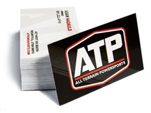
Your logo is often the best image to use on your sign. It makes the connection in the reader’s mind between your business and your message and builds brand consciousness at the same time.
Information
 An effective sign imparts its message quickly and clearly. A sign placed on the street should have only a few words and be very simple, since motorists will have literally seconds to read and process your message. Three to five words is considered ideal in this scenario.
A sign in the window or hanging over the entrance may be read by customers as they walk toward your store and can feature more information to excite the customer about sales or special merchandise.
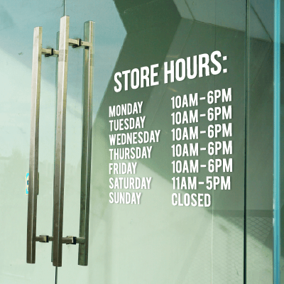
Signs placed at the point of sale, in areas where the customer has time to read longer messages, can be more informative.
Tailor your sign to its environment and you’ll generate informed, interested customers.
Color Combinations
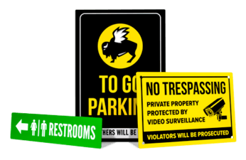
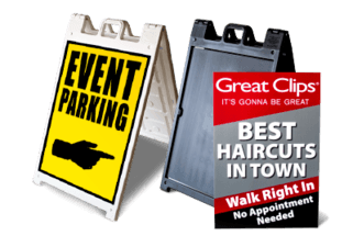
 Extensive research has been conducted to find which color combinations are most easily read. The best combinations are text of either black, dark blue or red and a background of yellow or white. White text is the most difficult for the eye to process.
Approximately 8 percent of men in the United States are colorblind. Dark blue text on a yellow background is the combination most easily discernible for people who are color blind.
When using more than one sign, stick to the same basic color scheme to avoid a carnival-like atmosphere. There should be some coherence between your signs, logo and other promotional materials.
White Space
Leave plenty of white space. The space doesn’t actually need to be white – this applies to backgrounds of all colors and refers to space void of text or images. White space allows the eye to be drawn to the text – which, after all, is the message you want to convey. Too many images or too much text can confuse the reader and don’t leave enough time for the reader to process all the information in the time she has to read the sign before she has passed it.
Studies show that 30% to 40% of your sign should be white space.
Your Message
 A sign is not something that should be hastily designed and thrown up in your store. Before you begin the design, spend some time thinking about the message you want to convey. Do you want to tell the customer about a special sale? Increase brand awareness? Give customers detailed information about your product selection? You won’t be able to convey all of these messages on one sign. Instead, let several signs each take on one task. You’ll be able to choose the appropriate elements to let each sign do its work most effectively and you’ll get the most return from each sign.