


When you begin to design a brochure, report or sign, one of your first choices is the type of font to use. And though it might seem inconsequential, the choice of font matters. The right font will enable your customer to quickly discern your message; the wrong font may keep him from reading your sign at all.
The history of typeface goes back to the 1450s, when movable type printing was invented at the beginning of the Renaissance. Gutenberg printed the first bible using a typeface called Textualis, which is almost indecipherable to modern readers. Since that first printing press, typeface has come a long way. In the beginning, the words font and type meant two distinctly different things, but now, in the age of digital typography, they are often interchangeable.
There are thousands of fonts available, but they can basically be categorized into five types. To determine the right font for your needs, you’ll want to know a little about each one.
Serif

A serif is the small, angled line projecting from the upper and lower ends of the letter. The most popular serif typeface is Times New Roman, which was created in 1931 for the British newspaper The Times. Serif fonts are the easiest to read, especially when dealing with large amounts of text (Times New Roman is still used extensively in book publishing). Other popular serif fonts include Minion Pro and Bookman Old Style. Use a serif font for brochures, newsletters and business plans.
Sans Serif
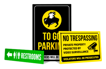
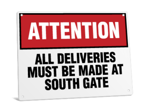
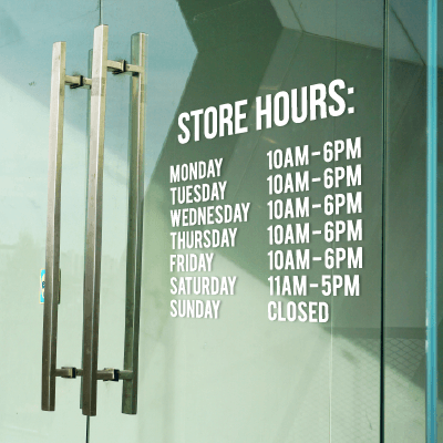
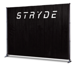
The word sans means “without” in French. Sans serif fonts are simply missing the serifs at the tops and bottom lines of letters. Most directional street signs use sans serif fonts (think of the STOP sign, for instance). These fonts are easy to read when the text size is large and there are few words. For most large signs, sans serif fonts are the right choice.

Script and Cursive

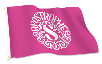
Script and cursive fonts are stylish and formal. The small difference between script and cursive fonts is whether the letters are joined together. If they aren’t the font is script–if they are, the font is cursive. They’re typically used on invitations and place cards. Script fonts are designed to mirror handwriting, but are difficult to read. These fonts should be avoided on documents such as business plans, letters and other professional documents, and should be used with care on signage.
Text
 Text fonts are the most difficult to read. This style was used to print the first Gutenberg bibles and was patterned after pre-printing press bibles that were handwritten by monks. Today, text fonts are only seen on the mastheads of newspapers, or on logos for businesses that wish to convey a sense of the Renaissance. Use sparingly.
Novelty
Novelty fonts can be either charming or annoying, depending on the usage. These fonts can be dangerous – once you begin dabbling with them, they can become addictive. Still, it is appropriate to use novelty fonts in certain situations for instance, a sign advertising Halloween specials might use a Halloween-themed font (but only if the sign has large letters and few words). Many novelty fonts are difficult to read. Novelty fonts should never be used for large bodies of copy, and should not be mixed.

Capital and Lowercase Letters
You should typically use a combination of capital and lowercase letters, which is the easiest to read. Avoid using all capital letters, except for headings in documents and brochures, and on signs containing three words or less. Never use all capital letters on social media venues such as Facebook, Twitter or your blog. On these forums, typing in all caps is akin to yelling and is considered very rude.
DON’T YELL
Words written in all capital letters using script, cursive and text fonts are almost impossible to decipher and should never be used.
Considerations
When you first begin your sign design, think carefully about your audience. Will they be reading a large amount of text, or standing in line at the cash register, reading your return policy? Will they be driving past your business, reading your sign while speeding along at 40 mph? Does your audience need a clear, easy to read font, or would a cute novelty font be appropriate? Choose the right font for your needs, and you’ll ensure that your message is read.