


It’s a new year – maybe it’s time to give your company’s signage a serious lookover and consider an overhaul.
Perhaps you’ve been simply duplicating your company’s same signage year after year – just changing out the sales dates and the current year. Or you’ve at least been adding your new sales pitch or messaging to the signs, but the colors, typeface, and sign dimensions have remained stuck in “sign limbo” since Toy Story 3 and Inception hit the movie theaters.
When you do begin considering what you might want to do different with your signage for 2021, there are a variety of ways to have your sign and message truly stand out. Take a look at the following list of 10 ways to “wow” your current and prospective customers, and see which could be integrated into your new signage:

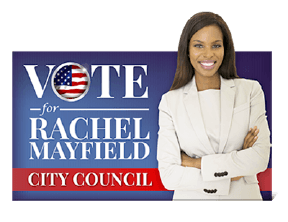
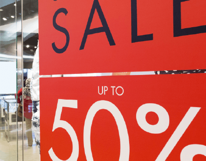
Add vibrant color(s) to your design: Don’t hesitate to utilize bright, vibrant colors in your sign’s design (beyond your brand’s standard colors) – bright colors tend to draw the eye more immediately than do bland colors. Of course, the usual rules of color still apply here: Avoid colors that might visually fight with the standard color(s) of your brand or logo; and don’t use too many colors in any single sign – after all, you’re designing a sign, not a ransom note. For more color tips and general color information, check out our “Color Your World” blog.

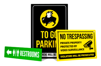
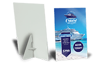
Integrate custom shapes: There’s nothing at all wrong with squares or rectangles – hey, we’re big fans! But consider how a different shape – say, a triangle, an oval, or other custom shape – will truly help your sign stand out. And let’s face it, different often gets attention. Naturally, you want to make sure that your message will fit within your preferred custom shape without minimizing the size of your typeface or any image you’re using. Nor do you want a custom shape to overly distract from the message itself. Many of the rigid signage you’ll find here at Signs.com can be cut to just about any shape you can come up with: aluminum, plastic, acrylic, foam board, and other materials.
Go bigger: Admittedly, there’s no definitive size-to-attention formula, but it stands to reason that size is another critical factor when it comes to increasing the number of eyeballs to your sign. By even just slightly increasing the dimensions of your signage, you can garner quite a bit more message space. For instance, if choose to move up from a 24” x 12” sign to a sign measuring 36” x 18,” you’re more than doubling your available message space (648 square inches vs. 288 square inches total) – that’s a lot of additional room for your graphic or a larger typeface.
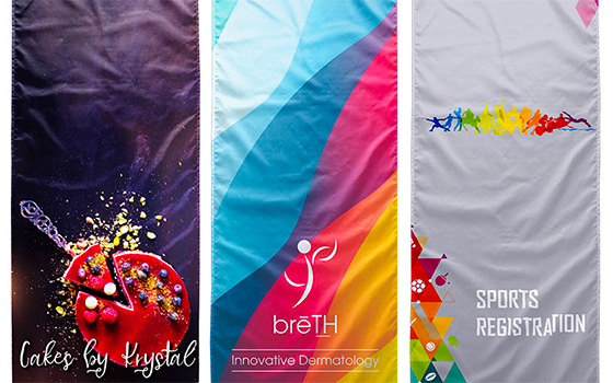
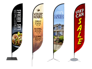
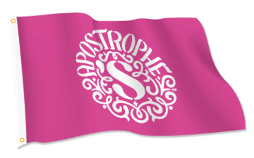
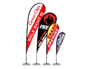
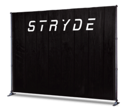
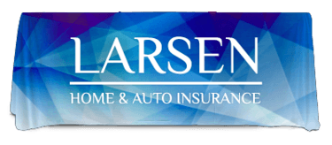
Speak softly, with fabrics: Fabrics won’t necessarily work for every type of signage use, but they’re ideal for banners, event displays, table covers, flags, and just about any application. You’ll be impressed with the different aesthetic that fabric brings to a sign – especially the vibrancy of the colors and how fabric brings a certain high-end cachet to signage. Plus, keep in mind that fabrics are more economical when it comes to shipping and extremely easy to store.

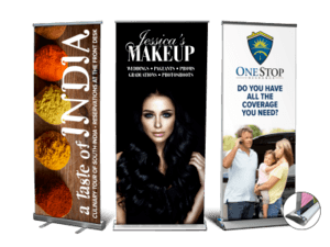
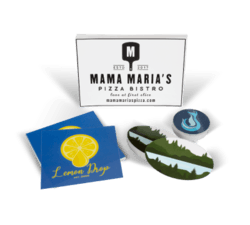
Utilize interesting and unique images: If you’ve been using the same image or graphic in your signage for the past several years, consider changing it up and giving yourself a new look, even if it’s just for temporary sales signage (in fact, now might be the perfect place and time for a “test run” of some new images for your signage). Don’t be afraid to utilize images that are visually arresting or make a prospective customer stop in his or her tracks. Another point about images: There’s nothing worse than after having designed a sign with a carefully crafted message, having it printed and installing it, and then see another store or company using the same image (and, of course, if that image shows up on a competitor’s signage, it’s even worse!). Avoid this “image nightmare” by regularly keeping an eye on your competitor’s signage. Also, remember that you should only utilize images you own the rights to or that you create yourself (see our “Acquiring Images for Your Signs” blog for more information).

Go B&W, monotone, etc.: Yes, very colorful signage is often preferred (see above), but you can also do just the opposite to have your message stand out – go for a black-and-white or monotone look. This is probably something you would want to pursue only occasionally/rarely, but by doing so you can provide your signage with some significant impact. As you might guess, going this route can be particularly eye-catching if you’re utilizing fine-art images, historical images, or trying to get across a message of a simpler, Mayberry-like time. Perhaps you’re celebrating a company anniversary with a series of “corporate timeline” signage, or showcasing a “signage picture album” of the company’s founders over the years. In any of these examples, a black-and-white solution (or perhaps a sepia-tone solution) can really move the needle on your message.
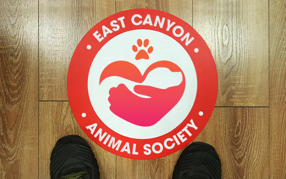
The floor is more: Many consumers have become more aware of floor graphics because of Covid and the necessary social-distancing messaging that retailers and restaurants have put in place. But floor graphics can be utilized for so much more – from in-store sales and promotions to directional signage and event graphics. Plus, keep in mind that floor graphics are no longer limited to just indoor environments: Our Street and Sidewalk Decals, for instance, feature an aluminum foil base, so they can be placed outdoors (as well as indoors) and on smooth or rough surfaces; they’re weather- and abrasion-resistant, and they have a non-skid, textured finish.
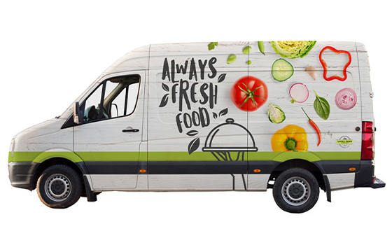
Make it mobile: If your business has any kind of company vehicle – car, truck, van, maybe even an old Segway gathering dust in the storeroom – and it’s not carrying your brand or the company’s primary message, then you’re doing yourself a disservice. The Outdoor Advertising Association of America (OAAA) reports that the average vehicle driven 15,000 miles per year will pass in front of 9 million other vehicles – that’s a heck of a lot of potential customers. In addition, the association says, nearly 30% of its survey respondents indicated that an advertising message on a vehicle or other outdoor media caused them to visit a retail store within a week of seeing the ad. Keep in mind that you can typically repurpose a design you’ve created for an in-store sign or window and slightly modify it when designing a vehicle graphic or even integrate it into a full vehicle wrap.
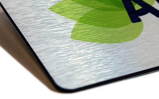
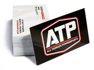
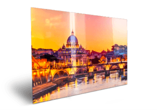
Add tempting textures, coatings, finishes: This tip certainly applies to smaller-format marketing and promotional materials such as business cards, flyers, and the like. You can add a glossy finish for a gleaming, lustrous look, or opt for a matte finish for a softer aesthetic. And in many cases you can pinpoint specific areas you want to add that glossy or matte effect, or simply “flood” the entire piece. Larger signage, can also integrate certain textures to good effect: Here at Signs.com, for instance, we offer Metallic Prints in sizes up to 4’ x 8’ as well as large-sized prints on glossy or matte paper. No matter the size of your sign or promotional product, an eye-catching texture or finish will enhance its curb appeal.
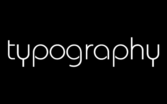
Reverse your type, use unique typefaces: Can you drive more attention to your signage by changing up your tried-and-true typeface? Or maybe you’ll benefit from using reverse type – a white or light-colored type on a dark background (sometimes called “knockout text”)? You might want to experiment with this for a special sales promotion or another small series of signage. Just don’t forget the number-one rule when it comes to typefaces and fonts: Your message must remain readable! In a poll sponsored by the Signage Foundation, consumers indicated several major factors that typically made a sign hard to read, including: letters were too small (83%); letters used a “fancy” font (48%); and letters were spaced too tightly together (36%).