


In the late 1970s and early ‘80s, one of the most recognized ads on TV (and in print) was from stock-brokerage firm E.F. Hutton: “When E.F. Hutton talks, people listen.” In commercials like this one, crowds in airports, restaurants and even golf tournaments all immediately stop what they’re doing when they hear an investor just barely uttering the company’s name (and then begin to provide some investment advice). The ad certainly made its point – if you want to be a successful investor, listen to the experts at E.F. Hutton.
Although color-technology company Pantone doesn’t have a TV commercial (as far as we know), its advice is similarly heeded – after all, it’s been the world’s number-one color authority for years. Just about every designer and graphic artist grew up with its Pantone Matching System (PMS), which is what enables designers to easily specify brand colors – like PMS 484 for “Coke Red.”
In addition, since 2007, Pantone has been announcing its Color of the Year. The chosen color has influence over product development and purchasing decisions in multiple industries, including fashion, home furnishings, industrial design, product packaging, graphic design, and more. Now, in case you missed it, Pantone’s Color of the Year for 2020 is Classic Blue (Pantone 19-4052). More on Classic Blue below, but it’s probably safe to assume that you’ll see this particular version of blue in all kind of environments and applications – including signage.
All of which got us to thinking here at Signs.com: What factors do you take into consideration when choosing colors for your signage?
We’re not talking about your logo colors – that’s a “fixed” color scheme that you certainly should not be playing with (unless you’re redesigning it, which is a topic for another day!). But what about other colors in your signs – after all, there are plenty of signs you create and install that don’t carry your logo. And even if a sign does include your logo, you likely are adding other colors to it as well – which colors accompany those signs?
Don’t worry: We’re not going to overwhelm you with a lot of in-depth color theory, nor throw a dozen color charts at you. Instead, our goal is to provide you with some general color considerations as well as those to keep in mind specifically when it comes to signage, and we’ll have a little fun along the way.
Complement or Stand Out?
When it comes to choosing color for signage, one good, first question to ask yourself is: Do you want your sign to vividly stand out from your surrounding décor – or nicely blend in with your existing design and color scheme(s)?
If the latter – that is, you prefer the sign’s colors to complement your existing store décor and design – then you’ll typically want your signage to set the same tone as the rest of facility. After all, you’ve gone to great lengths (hopefully!) to establish a look and feel for your operation, so why not play off that look and feel with your signage?
Say, for instance, that you have painstakingly designed your retro coffee shop to re-create a 1960s tie-dye/hippy-ish feel. Well, you wouldn’t want to spoil that look with signage that is, say, more muted or visually looks like an episode out of Miami Vice circa 1980s.
Or maybe your retail store is all about camping and the outdoors – you have likely invested heavily in a color scheme throughout that has a lot of earth-y colors like greens and browns; your signage probably reflects this general color palette as well. So you don’t want your signage to throw that color scheme out the window and, instead, showcase primary reds and blues.
For some purposes, however, you might indeed prefer that your signage sticks out like, well, the proverbial sore thumb. For instance, when it comes to signs for special or short-term sales: In this case, you might want the signs to be flashy and colorful – maybe even garish – even though your standard store signage and décor are more refined and muted. In this case, think “contrast” versus “complement.”
Keep in mind, however, that if you’re going to place such vivid and color-contrasting sale signs adjacent to your more muted standard signage, you run the risk of creating a bit of brand confusion with your customer. Doing so with short-term signage for a sale will probably be acceptable, but avoid this type of color chaos in the long-term.
Colors with Influence
Here’s another consideration to take into account when choosing colors for your signage: Are there colors that are predominant or regularly show up in your particular market, industry, community, or region – colors that you believe might serve to positively influence customers?
The most obvious example here: colors of local sports teams – especially college or professional teams. Orange, for instance, will play well in parts of Tennessee (University of Tennessee) upper New York state (Syracuse University), and southern Ohio (Cincinnati Bengals). Meanwhile, greens will likely be embraced in Philadelphia (Eagles), Boston (Celtics), and Wisconsin (Green Bay Packers).
Of course, many other influences that come into play when it comes to color and color choices.
For instance, we’ve all grown up with certain colors that have been established by city and municipal planners – traffic signals, for instance. “Red means stop, green means go” has been drilled into all of us since childhood. As a result, red continues to grab our attention in various situations and environments – including retail shops, where it can serve to stop many shoppers dead in their tracks.
Street signs reveal other examples of color influence. Stop signs, for instance, are universally red – and, again, red equates to stopping, whether in traffic or on a sales floor. But a quick history note: It wasn’t always that way – yellow was the standard color used for stop signs for nearly 30 years because it was more visible than the red paint that was being used at the time. It wasn’t until the 1950s that signmakers began utilizing a red that would be highly visible. And, it still took 20 years or more after that before some towns and communities would budget for stop sign replacements.
Meanwhile, various colors have been standardized across other types of traffic and municipal-type signage:
- Yellow, once the previous standard for caution or yield in street signs, has since been replaced by red with white, although it’s still used for hazards and school crossings (and in the previously mentioned traffic lights).
- Brown indicates outdoor parks, recreational, or cultural sites.
- Orange for construction (and other temporary work).
- Blue for rest areas, hospitals.
- Green for directional guidance signs (distance).
And, of course, holidays are associated with various colors from all around the color wheel – from green for St. Patrick’s Day, orange for Halloween, red for Valentine’s Day, and many others. Ensuring you’re synchronizing your signage colors to those associated holiday colors doesn’t just benefit your signage design – it can also lead to more foot traffic in-store and, hence, more rings of the cash register. For more information on holiday colors, read our blog, “Colors Associated with Emotions and Holidays.”
Pantone, we noted earlier, has influenced color choices for the past couple of decades via its Color of the Year selection. In elaborating on this year’s choice of Classic Blue, the company indicates how the color, among other things, is “imprinted in our psyches as a restful color … brings a sense of peace and tranquility … aids concentration …fosters resilience.”
This alignment of specific colors with certain emotions/feelings – the psychology of color, if you will –plays out across the spectrum and industries. Green equates to wealth and health; purple is spiritual; yellow brings with it positivity; and so on. We’ll devote an entire blog post to how color can be used to evoke emotions as well as actions in the future.
When the Color of the Year is announced in December, you can be sure that designers across numerous markets and industries – from product packaging and industrial design to home furnishings, fashion, and more – will begin integrating that color scheme into their latest products. Savvy retailers can get ahead of the game by considering integrating the Color of the Year – or at least a variant of it – into their own signage as well. (Here at Signs.com, we can match Pantone colors, but be aware this service comes with a fee per color, and it may slow your order.)
Some Color Basics
Whether you want your sign’s colors to blend in or stand out, and whether you utilize influential colors or not, there are a few good color “basics” to always keep in mind. Here are just a few tips on color combinations and color in general:
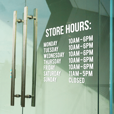
Avoid dark-colored type on dark-colored backgrounds: Sounds common-sensical, but you’d be surprised how many signs are out there with illegible messages because of this mistake. Ditto for light-colored type on light-colored backgrounds – your sign’s message will practically disappear.
Don’t use too many colors on one sign: Choose one or two colors and stick with them; too many colors will simply distract from your sign’s message. In short: Your sign is not a box of crayons.
Avoid reverse type (aka “knockout” text): If you must use it, use it sparingly, because there may be no better way to compromise readability. Yes, white text on a black background, for instance, can look “cool,” but you must be careful in choosing your type fonts (sans serifs only!); plus, be sure to use a large font size if you’re opting for reverse type. Take a look at our “Best Fonts for Signs and Banners” blog for some in-depth advice on this topic.
Learn and take advantage of color wheel basics: We promised early on we would not delve too deeply into color theory. However, if you become familiar with the basic color wheel, you can see that colors sitting directly opposite each other on the color wheel are natural complements – red with green, orange with blue, yellow with purple, and so on. Sessions College for Professional Design offers a free online Color Calculator that mimics the color wheel and enables you to quickly spot and select color options. You can quickly see which colors work together, which don’t, and also garner color values in CMYK (or RGB if you prefer).
Color isn’t perfect: Finally, keep in mind that, despite all the great technology that’s available to consumers, end users, and print producers, it’s not always possible to achieve an exact match between what you see on your home or office computer monitor and what you see in your printed sign. The reasons for this “chromatic disconnect” are varied, but often come about because of the differences between RGB color – what you see on your screen/monitor – versus CMYK color – which is used for printing. Always be sure you’re using CMYK mode to print, and remember that colors never look exactly the same from screen to printed output. (Jump over here for our in-depth blog on RGB vs. CMYK.)
Test Your Color Acuity
One more very important factor in making decisions when it comes to signage color: the person who’s choosing the color – and their color vision.
Color is, after all, subjective. We all see with varying degrees “correct” color, and it’s not uncommon for x number of people looking at the same picture or the same fabric, for instance, to see subtle (and sometimes not so subtle) differences in color. Of course, there are also folks who are color blind, although total color-blindness is very rare. More usual is red-green color blindness – making it difficult to distinguish between reds, oranges, and greens.
And, there’s this: Men are much more likely to be color blind than women. In fact, women are very seldom color blind (just 1 in 255), while 1 in 10 men are, according to the American Academy of Ophthalmology. Certain drugs can also diminish color acuity – including Plaquenil (hydroxychloroquine sulfate), the drug used to prevent or treat malaria, and which has been in the news of late due to its linkage to COVID-19.
But even if you’re not color blind, you might not be as “color-accurate” as someone else at your company – meaning, perhaps it would be best to let them at least help when it comes to making color choices for your corporate signage.
If you’d like to get a feel for how color-acute your vision is, you can take a Farnsworth-Munsell 100 Hue Test, in which you must place 85 color tiles in order of hue, ideally doing so under standard daylight conditions. Those test kits however, can be expensive, so X-Rite (which specializes in color-measurement technology and which acquired Pantone in 2007, by the way) has created a free online color-hue test, which will test you on 40 color hues and then provide you (and your co-workers) with a color-acuity score.
A ‘Bluetiful’ Day in the Neighborhood
We started this blog about a specific blue, and so it’s only right that we end it with two additional notes of interest on that color:
- As with many things in life, some color preferences and influences reach all the way back into childhood. What, for instance, was your favorite color of crayon? Crayola, the well-known crayon maker, reports that the most popular crayon colors according to its most recent Crayola Color Census are: blue, cerulean, midnight blue, aquamarine, periwinkle , denim, and blizzard blue. The only non-blue shades to finish in the top 10? Caribbean green, purple heart (think grape Popsicle), and cerise (a rose-red).
- This spring, YInMn Blue – aka Colorado Blue – was approved for use in all commercial color applications by the U.S. EPA. An inorganic blue pigment renowned for its vibrancy and high-reflectivity, YInMn Blue was discovered by accident at Oregon State University back in 2009 and Shepherd Color Company secured the license to commercialize the pigment a few years ago. Crayola even created a new crayon color – Bluetiful – that the company says was inspired by YInMn (it does not contain any of the pigment), and introduced it in 2017.
Our design team at Signs.com can help you set up your sign design, including making the best color choices for your particular project. Importantly, it’s free: We work with you for free on up to two mock-ups (as long as you plan on purchasing the product from us that we are helping you create a design for). Just complete the request form on our design services page to get the process started. We can also help with logo format conversion, photo/image retouching, sketch-to-design, and more!