Coca-Cola is one of the most recognized brands on the planet—surveys consistently find that around 94% of the world’s population recognizes the red-and-white logo. More than one billion bottles of Coke are sold every day, and people claim to prefer the drink over its main competitor, Pepsi. Why the everlasting popularity? While sound business practices and global reach certainly have huge impact, Coca-Cola has one huge advantage its competition does not: logo longevity.
The First Coca-Cola Logo
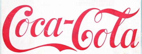
Coca-Cola has been around a long time. The first glass of Coke was sold in 1886, after pharmacist Atlanta Pemberton mixed up a concoction and added soda water to it. The first logo was created when Pemberton’s accountant, Frank Robinson named the product and wrote it out in Spencerian script. This is the first logo:
The Competition’s Logo
Pepsi was created just a few short years after the first glass of Coke was served. Its original logo was very similar to the Coca-Cola logo. In 1898, this is what Pepsi’s logo looked like:

But Pepsi didn’t stop there. Beginning in the 1950’s Pepsi started changing and developing its logo, sometimes changing it drastically. Meanwhile, Coca-Cola’s logo remained the same.
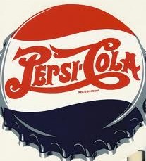
1950
The Pepsi logo incorporated a third color: blue. It still maintained the same script, but added the bottle cap image:
1960s
Pepsi ditches the script and the word “cola” and changes to a block text:
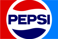
1970s
The bottlecap logo is changed, but the colors stay the same. This logo remains unchanged for around 16 years.
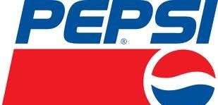
1991
A dramatic change in Pepsi’s logo.
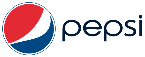
2008
The current Pepsi logo is a far cry from the original logo of the 19th century.
And the current Coca-Cola logo? Pretty much still the same:

Coke vs. Pepsi: It’s In Your Brain
In blind taste tests, people consistently prefer Pepsi over Coke. Yet when both beverages that are labeled, Coke wins every time. Researchers have coined this phenomenon the “Pepsi Paradox,” and for a long time could only guess that Coca-Cola’s marketing was responsible for the preference.
In 2004, Read Montague, a researcher at Baylor College of Medicine, did a study that showed just how ingrained the Coca-Cola brand has become to the millions of people who prefer it.
Montague performed MRI scans on volunteers while they drank both Pepsi and Coke. Sure enough, when people drank samples of both Pepsi and Coke, without being told which was which, they preferred Pepsi. The MRI scans showed that the Pepsi caused greater activity in the ventral putamen, the part of the brain that registers pleasure.
But once the volunteers were told which beverage they were tasting, they immediately switched their answers and stated that they preferred Coke. During that taste test, the medial prefrontal cortex of the brain lit up on the MRI. That part of the brain is associated with memories and self-identification. The higher-functioning prefrontal cortex actually over-rode the more visceral part of the brain that acknowledges pleasure—branding beat out actual taste.
Logo Longevity Leads to Brand Domination
So if people actually prefer the taste of Pepsi over that of Coke, why do our brains change our minds once we know we’re drinking Coke? Because we associate Coca-Cola with strong memories and identify the brand in positive ways.
Coca-Cola’s marketing has always been about creating feel-good memories. The old-fashioned Christmas advertisements with the vintage Santa Clauses, the “I’d Like to Buy the World a Coke” commercials, the more recent adorable baby polar bears… all are designed to evoke warm, fuzzy feelings about the brand.
Since the basic Coca-Cola logo hasn’t really changed since its inception, consumers can take all of the feel-good advertising and associate it with one image. When considering Pepsi, that isn’t the case, since the basic logo has changed so drastically over the years. So every time Pepsi releases a new feel-good campaign, consumers must connect it to a different image.
Longevity Doesn’t Hinder Creativity
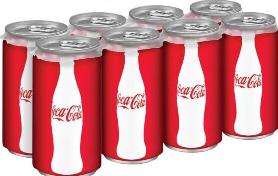
Coca-Cola’s basic logo hasn’t changed, but that doesn’t mean that the company is stuck with design from the 19th century. Coke has incorporated the Coca-Cola script into countless other logos in order to refresh its brand. Here’s an example of some of its latest branding. Though the can design is more sleek and modern, the script logo is still present:
The Longevity Lesson
Sticking to one logo doesn’t mean that your brand will feel stale and old. Instead, it helps maintain that brand throughout the years and multiple advertising campaigns. People like the comforting feelings that tradition holds. They’re able to create stories around a brand when it looks consistently familiar.
So when you’re creating your first logo, aim for a timeless design that can be incorporated into your branding for decades.


