


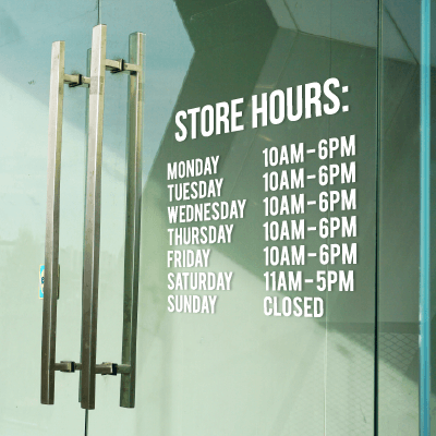


When you’re looking to print photos, you’ll often have a choice to make when it comes to finish: glossy or matte. The same holds true for a variety of printed marketing products – from business cards and labels to table tents, hang tags, and rack cards, you’ll often be able to select either a glossy or matte finish.
Just as beauty is in the eye of the beholder, which finish you choose is primarily an aesthetic preference. And while it’s true that you really can’t go “wrong” with either finish, there are some practical considerations to keep in mind when making that glossy-or-matte choice.
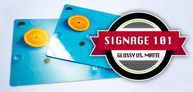
In this Signage 101 blog, we’ll examine those considerations and see if we can help you determine what finish might work best for your sign, photo, or other marketing piece.
Becoming Glossy or Matte
Ever wonder just how a paper or other substrate gets to be glossy or matte in the first place? As it turns out, there are two primary ways to achieve a glossy or matte finish:
● A paper or substrate has the finish “baked in” – The specific gloss or matte finish is achieved when the paper or substrate receives a chemical coating during the manufacturing process. The finish and smoothness (texture) will also be affected as the substrate is then passed through hard-pressure rollers (“calenders”); basically, the more or better calenders it’s run through, the more glossy it will become.
● A finish is added with a coating post-print – Print providers like Signs.com can also add a coating after the piece has been printed, typically to add extra gloss (although there are also matte and semi-gloss coatings as well, depending upon the print provider’s machinery roster).
It doesn’t truly matter how the gloss or matte effect is added – either up front or on the “back” end; the results will be similar.
Glorious Glossy
Think “bright,” “reflective,” and visual “pop” when you’re considering a glossy finish, and you’re on the right track for this smooth effect. Glossy works especially well with images (versus lots of text), especially high-contrast images.

Glossy’s other attributes include:
Vivid colors: It sounds like a cliché, but you will indeed get redder reds, bluer blues, greener greens, etc. with a glossy finish. That glossy finish will make all of your colors seem to burst from the photo or sign.
Richest blacks: A glossy finish will also result in your print’s blacks being more impactful – a pure, deep black that you’ll never confuse with gray.
Low-light friendly: Because a glossy finish will be highly reflective – especially under direct lighting – this finish does its best work in low-light settings.
Equating to luxurious, prosperous: For many, a glossy look visually feels like something that’s inherently valuable and expensive, and is something to be kept or treasured (versus tossed into the nearest circular file). Glossy carries a “modern” feel to it as well.
Marvelous Matte
When it comes to a matte finish, two descriptors that likely come to mind are “flat” and “soft.” A matte finish works very well with low-contrast or muted images – those without a lot of difference between the darks and the lights.

Other advantages of a matte finish include:
Fingerprint avoidance – Matte’s ability to ward off fingerprint smudges is particularly important when it comes to photographic prints.
Reflection protection – Matte is the best choice for displaying under bright lights because a flat finish won’t offer any reflections, unlike its glossy counterpart. Even under glass, a matte finish will still fend off reflections.
Accentuating image details: The matte finish will naturally allow the eye to see more detail in an image, and not be so visually “challenged” by a shiny gloss finish.
Write-ability – If you want someone to be able to write on the printed product with a pen – think business cards, for instance – then matte should be your choice. Ink smudges more easily on a glossy finish.
That “artsy” feel – A matte finish will help a black-and-white image maintain an artistic aesthetic. Matte also works nicely with sepia-tone and historic images.
Semi-Gloss, Metallic, and More
If you’re reading this blog and wondering, “But aren’t there more finish choices beyond glossy and matte?” the answer is yes.
Semi-gloss is the “in-between” finish – not quite as glossy as glossy, but glossier than matte. You might see it referred to as “luster,” “satin,” “pearl,” or any of half-a-dozen other names by print providers, photo houses, and even the paper producers themselves. Alas, there’s no industry-wide agreement on any of these terms, nor on just what constitutes “semi-gloss.” But, generally, all of these terms point to a texture somewhere between glossy and matte, with the final texture varying by paper/substrate and finish.
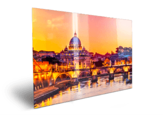
One other texture to highlight here: Metallic. The metallic effect is typically the result of a metallic layer (usually a polyester film such as Mylar) placed between the paper or substrate and a glossy coating. The result: a metallic look and pearl-like appearance to the printed image, with colors that really pop. The paper itself will be more durable than standard glossy or matte paper because of the metallic layer; but keep in mind that the glossy coating will not deter fingerprints. Ideally, prints on metallic paper will display best under good lighting – prints placed under dim lights won’t achieve the full metallic effect you’re looking for.

Here at Signs.com, we offer several products with glossy, matte, or other finishes:
- Photo prints – glossy, matte, and metallic
- Postcards – glossy and matte
- Brochures – glossy and satin
- Rack cards – glossy and matte
- Door hangers – glossy
- Table tents – glossy, matte, semi-gloss
- Hang tags – glossy and matte
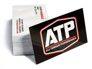
- Business cards – glossy, matte, and more
- Stickers – glossy and matte
- Roll labels – glossy, semi-gloss, and metallic