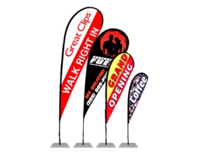
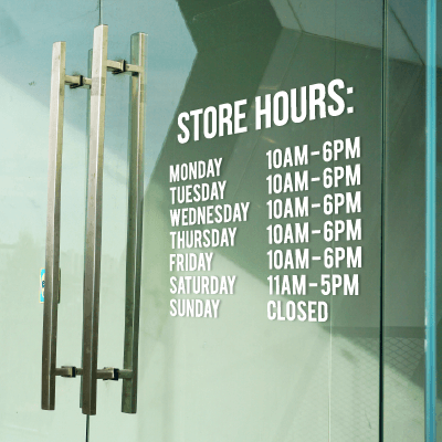
Letter sizing matters! It’s an often overlooked aspect of creating custom signs, but letter size is one of the most important features to consider when designing a sign. Letter size (also referred to as letter height) will determine from how far away your message can be read. Lettering that is too small or too big will affect how the quality of your sign, so it’s crucial to know what letter height works best for a particular viewing distance. We’ve compiled a list of key features of lettering – including font size, color, type, sign placement, and lighting conditions – that you should pay attention to when designing your sign.
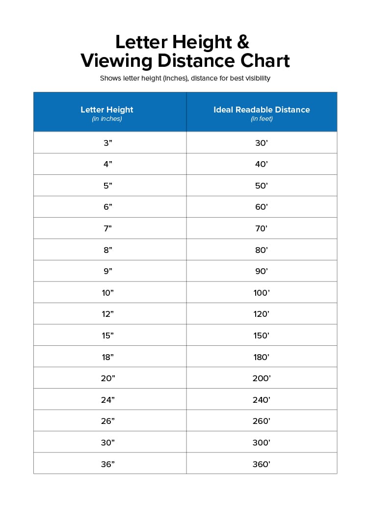
Font Size – In order to determine the letter size used for your sign you will need to get a general idea of what distance you want your sign viewed at. Generally speaking, for every 10 feet of viewing distance away from your sign, you will want to increase the letter height by 1 inch. For example, if you want the text viewed from 150 feet away, you’re going to want to have the text be at least 15 inches tall. We’ve included a chart that gives letter height and distance increments based on this rule of thumb to easily see what letter size you need for your sign.
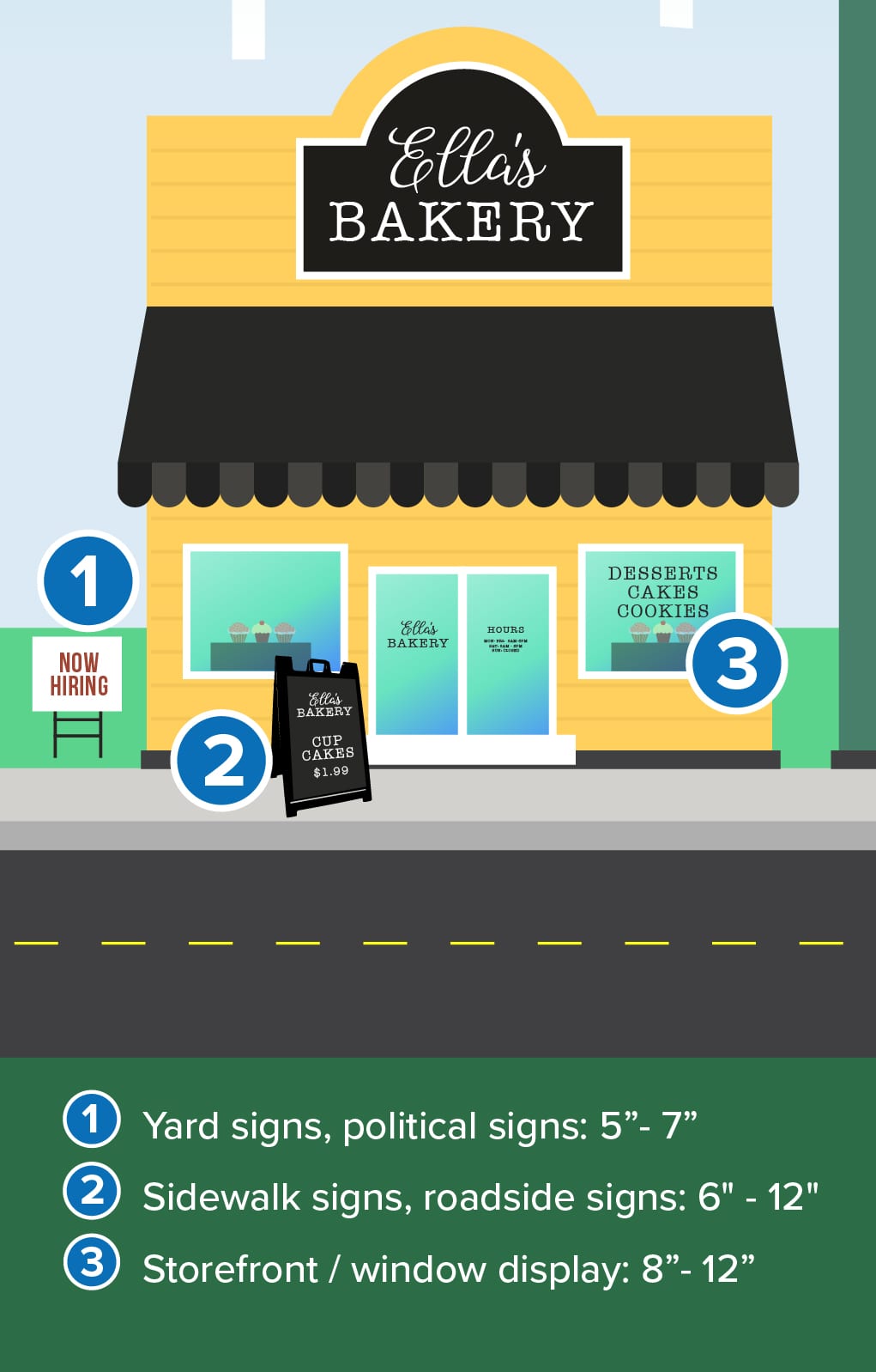
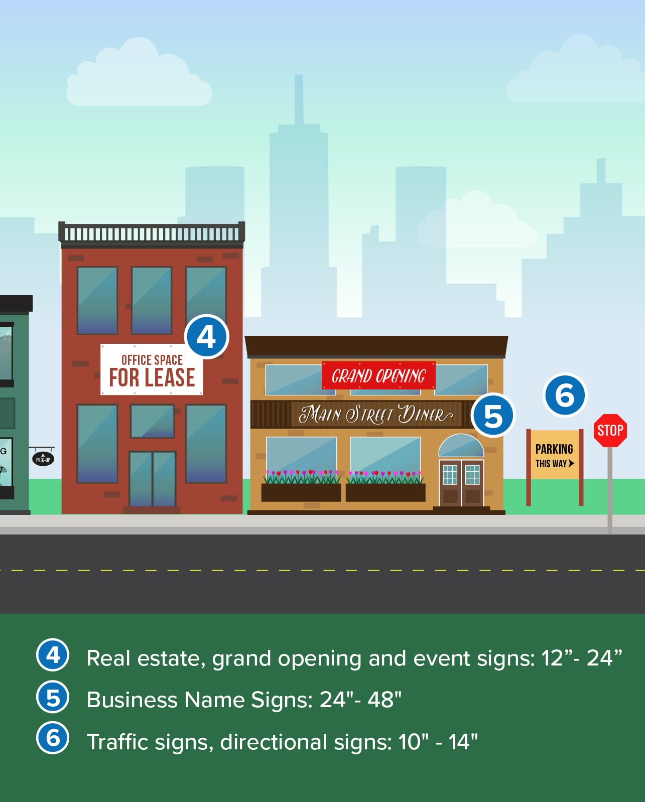
Common Font Size Examples:
As stated, these are only recommendations / examples for common letter height for certain sign types. We recommend using the letter height chart above or the 1” to 10’ rule of thumb to determine the best sizing for your sign’s letters.
The graphics below will show typical letter height for specific types and uses of signs (not viewable distance).
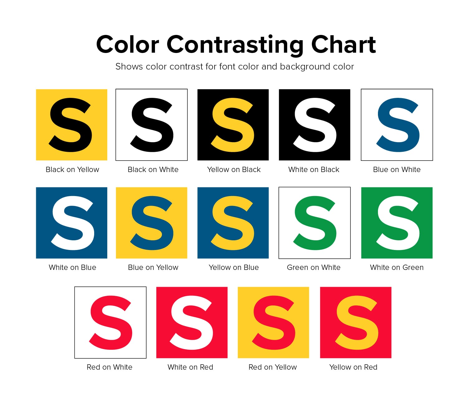
Font Color – For greatest visibility of letters, use colors that contrast with the background color of your sign. We’ve included a chart below that outlines common color combinations for the best visibility. The general rule of thumb is that you should use a light colored background with a dark letter, and vice versa. A dark background with dark letters is not ideal for visibility purposes. This is especially true for storefront signage such as vinyl lettering and window decals that may be placed on tinted windows. (We go over the differences of all of our different window signage options here.)
Font Type – Recommended letter heights and the letter height visibility chart (see above) are based off of fonts that are Serif or Sans Serif (and variations of these font types). Decorative and script fonts are harder to see when used with smaller font size. If you do include decorative and script fonts on a sign, make sure that the letter height is adjusted to increase visibility. Even with an increased size decorative fonts are simply harder to read than block fonts.
Sign Placement – Letter visibility will be affected by where you place the sign in relation to sidewalks or roadways. Take into consideration the angle of where you are placing the sign and the angle of the the viewer (whether in a car or walking on a sidewalk).
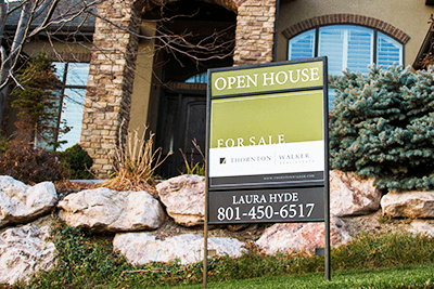
Signs placed perpendicular to the line of sight of a pedestrian or driver are easier to view than those placed parallel to a road or walkway. Nonetheless, larger font sizes will still be more visible even if placed parallel to the line of sight. Signs below or above eye level should include larger letters for increased visibility.
Lighting conditions – Signs placed in direct sunlight and well-lit rooms should be adjusted accordingly. Bright colors (yellows, oranges) and pastel colors will be harder to see when light shines directly on them. Use darker colors to increase the visibility of letters in well-lit or bright conditions. Likewise, dark lighting conditions or dark surfaces (like tinted windows) will require lighter colored lettering to improve visibility.
For Best Visibility
These principles are easy to understand and don’t require any special graphic training. When in doubt, use larger letters with fonts that are easily legible and font colors that contrast from the background color of your sign and/or application surface. Place your sign in a conspicuous location that allows for maximum visibility and make sure that direct light doesn’t affect the quality of the sign. If you have any question on sign design and letter height, we have an all-star team of designers that offer free design help as well as an award-winning customer service team that would be happy to help.

