Since I began writing the blog for Signs.com a year ago, I can’t seem to get away from signage. It’s everywhere: along the freeway, on the parkstrip in front of shopping centers, even inside public restrooms. I see good signage. I see signage that is so-so. But I also see some pretty bad signage. Most of the problems that I see with truly bad signage could be easily fixed, if only the person who designed the sign knew what design mistakes to avoid.
To get some professional advice, I headed over to our design department. Not to brag, but we’ve managed to hire two of the most incredibly talented artistic minds on the planet: Creative Director, Brian Jackson and Graphic Designer, Melissa Moyle. They sat down with me to share the top 8 design mistakes they see most often.
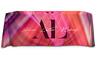
1) Trying to do everything on one sign.
According to Brian and Melissa, the first thing to do when designing a sign is to decide what the function of that sign should be.
Brian: I don’t think that people really ask themselves what the sign is supposed to be doing for them. People try to serve more than one function per sign instead of focusing on conveying one thing really well.
Once you’ve decided what the function of the sign is, you can choose a hierarchy of design elements. For instance, if a sign’s main purpose is to alert customers of the business location, then the phone number doesn’t need to be larger than the logo.
Melissa: I agree. I think that sometimes people feel like they have to add tons of information to every sign in order to feel like they’re getting their money’s worth. They try to put too many lines of text on a sign, or they add a bunch of crazy images and colors because they think that those things will make the sign stand out, but really it’s all just detracting from what they want to tell their customers.
Here’s a great example of a sign design that’s trying to do too many things at once.

Here’s the improved version. Because it conveys the main function, the “Frozen Yogurt” text is centered, larger than the rest of the text and in a different color. Notice that the rest of the text is much smaller than in the first example. This allows for emphasis of the main function—Frozen Yogurt.

2) Forgetting Legibility.
Brian: If you’re trying to communicate something far away, you definitely don’t want to dilute your message by using an unreadable font. Fancy script and heavy gothic fonts are really hard to read, even when you have tons of time to sit and stare at them, let alone when you’re speeding past in a car.
Melissa: People also struggle to read text that’s too small. As long as you’re not trying to put too much information on one sign. you should be able to make the text large enough to be legible from a distance.
3) Using the wrong font.
Brian: You want to make sure that the font on your sign fits well with your business. Just because a font is popular doesn’t mean you should use it. Some fonts are so overused that they become cliche′. The Papyrus font really took off with health/wellness and spa businesses. It became widely associated with those industries. But now it’s everywhere: Mexican restaurants use it. Clothing stores. I even saw a sign on a cash register in a Chinese restaurant that used Papyrus. It’s confusing to customers to see a sign with a font that seems out of place.
Melissa: Comic sans is another popular font that’s used in the wrong place. Yesterday I drove past a sign that said, “Smoke Shop.” It was in comic sans balloon letters, with rainbow colors. The sign looked more appropriate for a daycare center or a business that hosts birthday parties with bouncy houses… not a business that sells cigarettes.
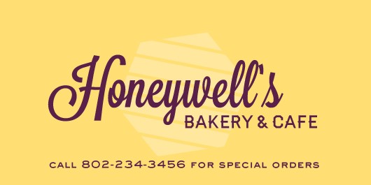
Here’s an example of a sign with an inappropriate font. The business is obviously not a health spa. It’s not the most horrible sign in the world, but it could be better.
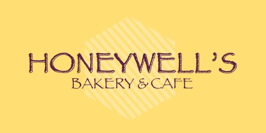
This sign uses a more unique font that looks warm and inviting. It’s not the same font that everyone else is using.
4) Lacking consistency with other signage.
Brian: Consistency is important. A lot of small businesses don’t have what we would consider a brand per se, but if you’re going to be hanging several signs and you have a website and a storefront, some sort of consistency is nice. Is it possible to use the same font on each piece to tie some things together? Can you stick to the same color theme throughout?
Melissa: Sometimes it’s easy to think that every sign should be unique: this sign is red, so the next sign should be blue. This font is fun, but this font is cool too, so we’ll use one on each sign. Trying to make each sign unique makes a carnival of signage—not a cohesive brand.
5) Using color in tragic ways.
Brian: A sign’s basic function is to communicate something and the finished sign should speak to that; it should serve that function. If there’s anything happening there that detracts from that, you’ve got a less effective sign. Color is often the culprit when it comes to distraction.
Melissa: Just because you like a color combination doesn’t mean you should use it on your sign. Some colored text is really hard to read when placed on top of other certain colors. Using an entire rainbow on one sign is annoying and doesn’t usually help get your message across.
This turquoise lettering on this red background is really hard to read and it’s so bright it hurts your eyes.

This color scheme is easier on the eyes and, as a result, easier to read.

6) Ignoring proper sign installation.
Brian: I hate to drive past a business and see banners that are twisted and folded, or deflated balloons dragging on the ground. Get out there and re-stretch and tighten your sign every so often so that it looks nice. There also comes a time when you should get a new sign. Banners that are eroded and ragged look terrible.
Melissa: Remember that your sign represents your business. It’s worth it to take the time to fix sagging signs and replace old ones.
7) Having fear of white space.
Brian: Some people have what we call horror vacui. I just made that up, but it’s a very real thing— the fear of white space. Feeling like the entire sign needs to be filled in… every square inch. That’s a huge common problem. Isolation can have as much impact as scale.
Melissa: Size isn’t the only way to emphasize something. Using letters and images that are too big just crowds the sign. If you leave plenty of blank space, the letters and images are more prominent.
This sign has a lot going on. The business name takes up almost one-third of the sign.
This sign has basically the same text, but the business name is smaller, which leaves plenty of blank space around the name and actually makes it more noticeable.
8) Failing to get help from a professional.
Brian: Whether it’s us or someone local, I recommend that people use a professional graphic designer.
Melissa: We’re here for our customers. We can work with people to improve their sign designs, or can even start fresh and create a couple new design concepts. Our services are free, so don’t hesitate to call us when you need help.
The Final Word:
Brian: Your signage is all about building trust and credibility. Your sign is telling people something about your business. If the sign has bad grammar, if the colors are loud, or the design isn’t appropriate to your audience, those things reflect poorly on your business..
The bottom line is simple: Focus on the function. Make it clean. Make it legible. And if you’re struggling with design, get some help.