Your customers are exposed to hundreds of ads a day between TV, Radio, browsing the web and their commutes to and from work. So what kind of ads do you need to create to really get their attention?
We’ll work to answer that exact question in our latest series called “The Effectiveness of Signage,” where we cover the do’s and don’ts of sign advertising.
Our First Experiment
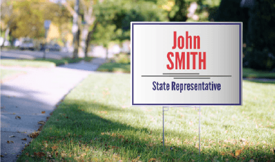
On our drives to work every morning, we see all sorts of signs. There are yard signs for political campaigns, security systems, realtors and so much more. Along the busier roads, there are signs plastered all over telephone poles and crosswalks.
Then there are the sign spinners. Those guys or girls who hold signs and dance like their life depends on it. We’ve all seen them, but does all that boogying really work?
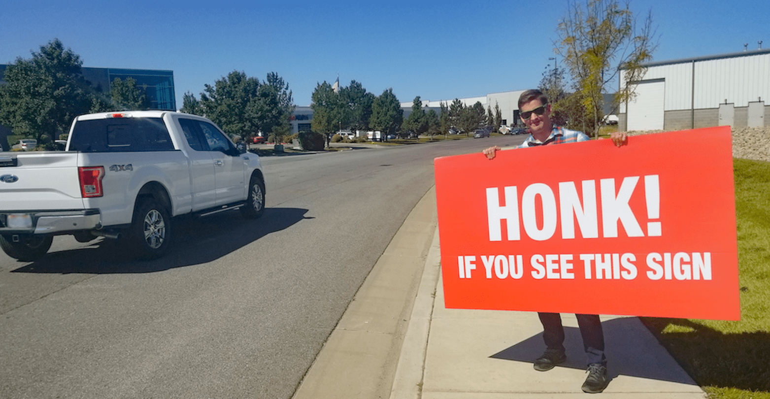
At Signs.com, we wanted to find out. We decided to test a few signs of our own served to oncoming traffic in a Metropolitan area, with the simple invitation, “Honk if you see this sign.”
Our ultimate goal was to see whether a person being present with the sign made a real difference in completed calls to action. The results might surprise you!
Too Long, Didn’t Read
Before we dive into how we conducted our tests, here are some of the nuggets we’ve pulled out of our findings you can take advantage of right now. We’ll go over the specifics of how we arrived at these recommendations throughout the rest of the article:
- Signs get noticed despite repeated studies claiming we’re blind to ads.
- Using a person boosts engagement: if it is appropriate for your business, try having someone stand out by the sign to help attract customers—the human element will drive a greater response rate than just having a sign posted.
- Use color contrast.
- Make your message short and clear for drivers passing by to read.
- If you want to get more people to respond to your sign, make your call to action (CTA) as easy as possible (low-involvement) to eliminate barriers. (keep your message simple)
- Give oncoming drivers enough time to react to your sign.
- Location matters—make your sign as visible as possible. Place your sign in a well-trafficked area when possible.
How We Did It
A good experiment needs a sound method. We wanted to see how design, sign size and amount of text could affect the responses of drivers on their morning commutes. Take a look at each of the 11 signs below along with how we used each in the test:
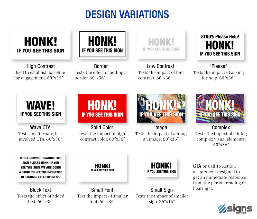
For each variation, we used three different ways of presenting the sign:
- Sign Standing Alone: just set up on the side of the road with no one near the sign
- Sign Held: No Motion—where one of our employees held the sign, but didn’t move… at all
- Sign Held: With Motion—where one of us played the role of the sign spinner.
For each test, we showed each sign to 100 oncoming cars, in a moderately trafficked metropolitan area, just outside of Utah’s Capitol, Salt Lake City. To make sure drivers only had enough time to read the sign while driving rather than stopped at a traffic light, we conducted the experiments a quarter mile from the oncoming stoplight and 200 ft away from the stop light behind us.
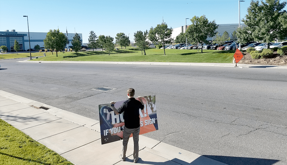
It would only take about seven minutes for each round of 100 cars to pass us. To make sure we were only counting completed calls to action from those who saw the sign, we ignored honks and waves from cars driving in the opposite direction who honked or waved without actually being able to read the signage. Keep that point handy: the people on the other side of the street offered an interesting insight!
It’s important to note that because it was an especially windy day, we could not put up the small sign by itself because it kept blowing away.
Results
And now, for the good part. We’ll look at the data in a couple of different ways and walk you through the most salient takeaways. Keep in mind that this isn’t a perfect study, but what we found does give us a glimpse of what works and what doesn’t work when it comes to small business advertising signs.
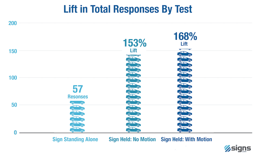
Before we dive deeper, looking at the chart above, the “Sign Standing Alone” test received the least amount of engagement compared to either of the other two tests. Whether moving or not, having a person present with the sign increases responses by over 150%.
So if you’re wondering whether sign spinners are worth the extra money, the answer is yes! Without a doubt introducing a human element dramatically increased the response rate of the signage. We didn’t perfectly imitate sign spinners during our test—during the second round of testing we simply stood behind the signs, and for the third test, we waved the sign back and forth a little. Even still our presence with the sign made a dramatic difference in engagement. Assuming customers would act on a sign with a human element to it inside your store then we believe it is safe to say that the extra cost is worth it.
Adding motion to the sign, however, only increases responses by about 6% over no motion. So adding a sign spinner really does work! But don’t stress if your sign spinner doesn’t have great dance skills. Let’s take a look at the total responses across all tests for each sign.
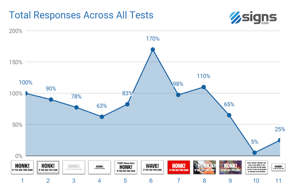
Far and away our most completed actions came from waves (sign 6) compared to honks. On the other hand, responses to sign 10 was very low (95% fewer responses than the basic black text on white background). Some other things things that really stand out when looking at the results this way is that small text and small signs aren’t as effective as larger text and larger signage.
Digging Deeper
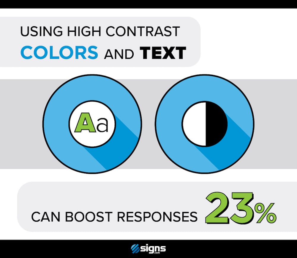
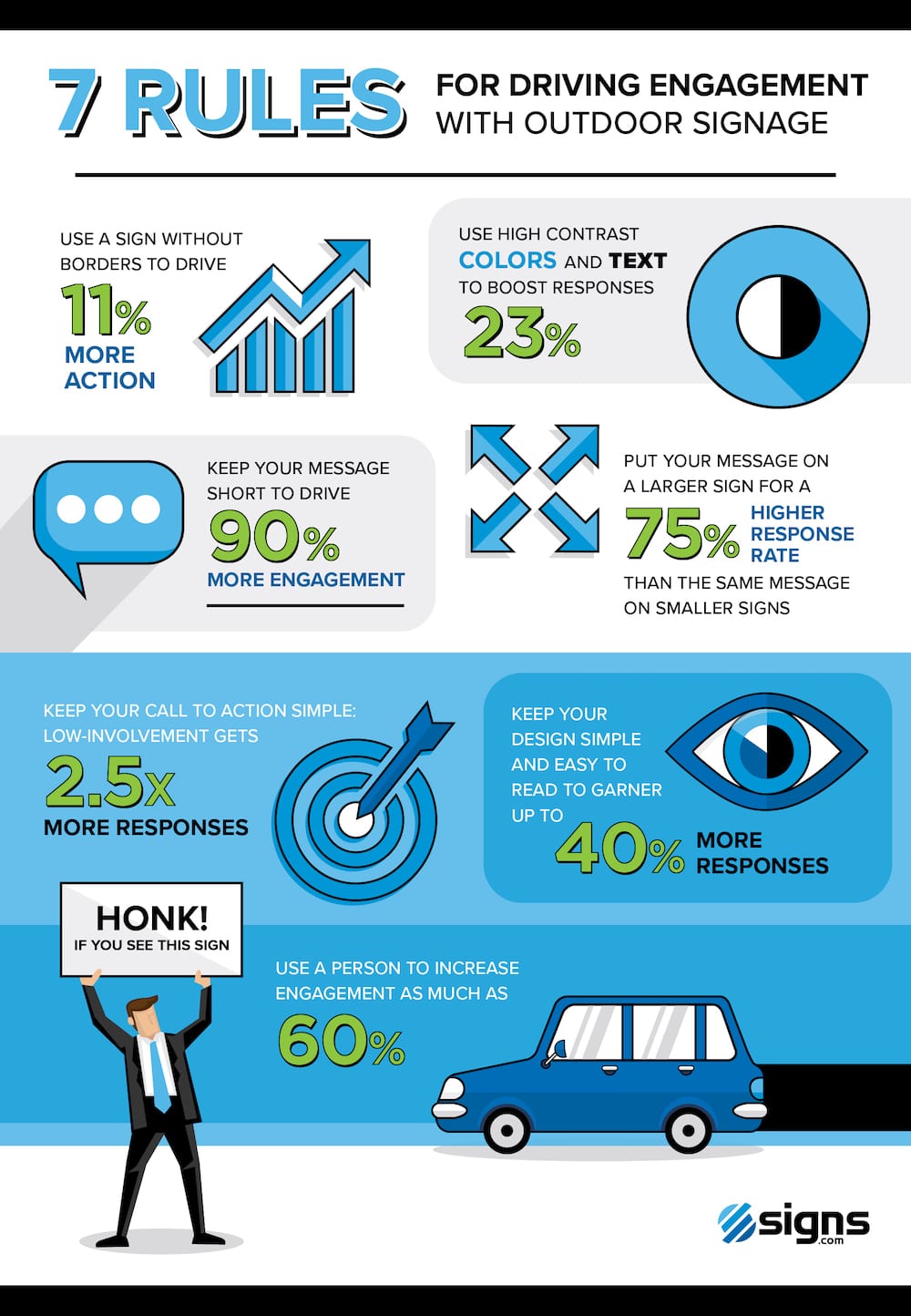
Using high contrast in text and color on your signs can boost responses by as much as 23%.
Short, concise messages are over 90% more effective at driving engagement.
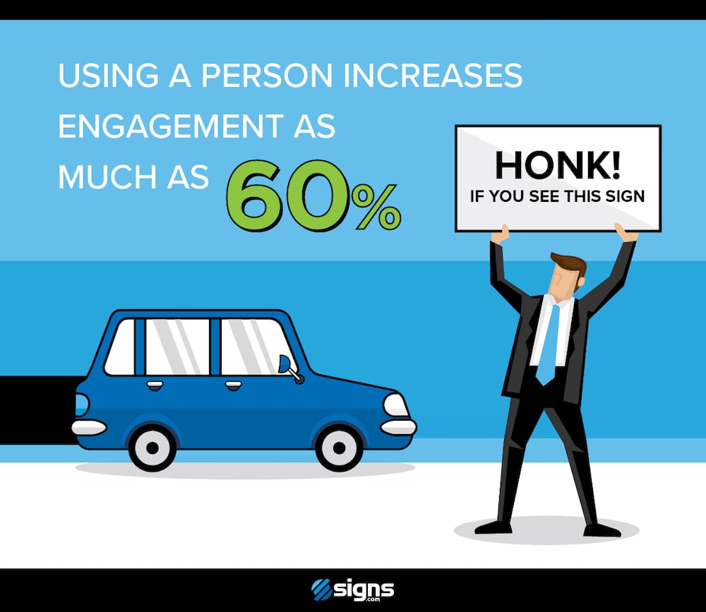
Using a person in with your sign can increase engagement as much as 60%.
A few others to consider:
- Compared to its larger counterpart, the small sign received 30 fewer completions than the control. That’s a 75% decrease in response.
- By far the worst performing sign was the block text sign, which received only 2 total completions across all the tests.
- Switching to the CTA of waves instead of honks increased responses by 70% from the control.
- While adding an image to your design won’t hurt your response rate, having a complicated image proved to be too distracting. There were only 26 total responses for the complicated image compared to the 44 responses with the normal image.
So what does all of this data mean? Let’s take a look at the practical applications for small businesses and sign advertisers.
What This Means for You
One of the more obvious takeaways is that people notice signs while driving! Whether they pay attention or not relies heavily on design, copy, and size. As long as the text was legible, the design didn’t make a major difference, as long as it didn’t get too crazy (See the results for the sign with the “Complex” purple, orange and yellow design. )
Plenty of people saw our signs but for whatever reason, didn’t complete the CTAs. Maybe they were just reluctant to honk or wave; maybe they absent-mindedly read the sign. What was interesting is the place at which most drivers would complete the call to action. Let’s look at the graphic below:
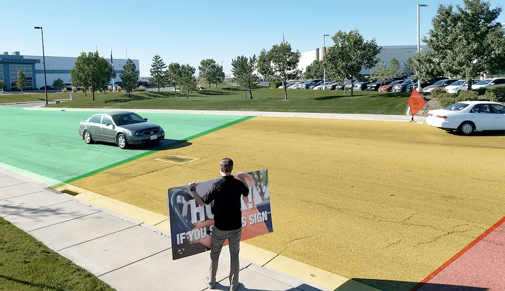
About 20% of drivers would read the sign as they approached the green zone,
but wouldn’t react to the message (honk or wave) until approaching the red zone.
While in the yellow zone, it appears drivers are processing your sign’s message.
There is a clear delay in how information is processed when attention is divided. So it’s important to keep your messages short and legible. Additionally, you’ll want to place your sign spinner far enough ahead of the entrance to your business to give drivers time to connect the dots and turn into the parking lot.
And while our CTAs aren’t anything you would use in the real-world – comparing waves to honks – it seems people are more likely to react when there is less of a cost to doing so:
Waving is an easier response than honking as it is less likely to be noticed by other participants around them. So it’s important that your CTA when trying to reach drivers is low-involvement. Keep that in mind for your objectives, especially since this type of advertising is usually at the top of the sales and marketing funnel.
Final Thoughts
Another key takeaway is that people are drawn to other people. More specifically, they’re drawn to faces. When people see someone holding a sign on the side of the road, they will see the person holding the sign, then they will read the sign. If you want to boost the visibility and the reactions for your sign, the best way to do that is have a person holding your sign. That’s all the more reason to keep your messages brief, as passerby will read the sign only after looking at the face behind it. But sign spinners do work!
One of our biggest surprises though: remember how we said we ignored the honks and waves from people coming the opposite direction of our sign? There were a lot of them. Part of this could be what’s thought to be the monkey-see-monkey-do phenomenon (apparent because some of the honking from the opposite direction was excessive). But some even stopped in the middle of the road to turn their heads to get a look a look at what they were missing.
So FOMO plays just as much a role on the road as it does online. Don’t know what FOMO means? You’re experiencing it right now: it stands for “Fear of Missing Out” and it’s a powerful insight that marketers can use to drive traffic and sales. Take advantage of it!
Conclusion
Are you interested in increasing your business traffic with signage? Signs.com has you covered! We have over 75 types of signs to choose from with free design services and quick turnaround times. Check out the selection and get your business seen with high-quality signs.
Fair Use Statement
Feel free to use this data for your own research. We encourage sharing for non-commercial purposes. If you do use our content on your own site or social channels, simply attribute us with a link back to this page.

