
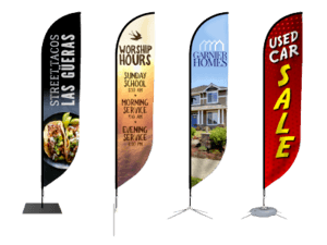


From time to time here at the Signs.com Communication Department, we like to sit back and let others do the heavy lifting. That’s why today’s post is courtesy of our friends over at Business Logos. Business Logos, founded by two pioneers in the online graphic design industry, caters to small and medium businesses and entrepreneurs. Knowing that many of the logos they design go on to be integral parts of signage all across the U.S., we asked them to give us some of their best design “tests” that companies should employ when creating their signs.
The “Glance” Test

Here we see a roadside strip mall, just completed and ready to be occupied by local businesses. The decisions the shop owners make in designing their logo and signage at the start will make a big difference on the amount of foot traffic their sign generates. As we have seen before, a company’s sign generates a whopping 50% of its walk in traffic. Over the life of a company, optimizing the signage can have a huge effect on the bottom line.
To get the most out of your sign, remember that it will be glanced at quickly, usually from a moving vehicle, and it will be competing with multiple distractions. The layout for the sign should be considered and maximized for “glance” recognition. Sign dimensions should be considered in order for your business to compete with nearby competition. If your business is local, it’s important to make sure your signage does not immediately brand you as small-time; rather it should look as good or better than the national chain stores which often inhabit the very same space as you, the small independent shop or business owner.
The Combination Test

Here we see a strip mall already inhabited with businesses. The picture is presented in low resolution to remind us how a potential customer generally sees the signage. We can see that the corner store’s owners, who already have a location advantage, designed their logo and signage so the word and icon don’t muddle together when viewed from a distance. At this angle, the other signs are almost illegible, with some combining their icon and typeface, yet they are only ten feet away from the correctly designed sign.
The Space Test

Here we see a local burrito business, placed in between two national chains in a strip mall. Our intrepid burrito stop has thoughtfully used the full vertical and horizontal space, and left enough white space in the logo so that it can be read at a distance. The business also used a deep red to overpower or at least compete with the polished presence of Dunkin Donuts and Comcast. We say well played.
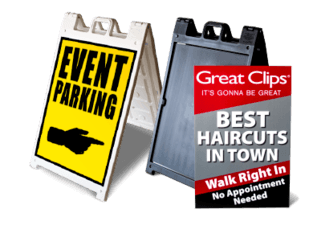
Raise your bottom line; give attention to your sign. If your logo is too complex to be read at a distance, consider having a simplified version of it created.
Aaron Nabaum is the co-founder and owner of businesslogos.com. As a graphic designer, Aaron has earned various awards including the All-University drawing award at Colorado State University, 2007 American Graphic Design Award, and publication in LogoLounge in 2011. His clients include Raytheon, Nestle and Hewlett-Packard. Read more about Aaron and Business Logos at http://businesslogos.com/