
Take it From the Experts: 6 Tips on How to Design Your Banner
A good banner design draws attention and guides people to understanding and remembering key details, such as new store address, the date and venue of an event, or the details about a product or service. It can also prompt them to take your desired action, whether it’s to visit your store, join a contest, or shop on your website. Interestingly, a lot of people can tell the difference between a good and bad design, and yet many will likely struggle to provide a straightforward explanation.
To help us understand what constitutes a great banner design, three experts shared the most fundamental banner design tips that convert and deliver the best ROI
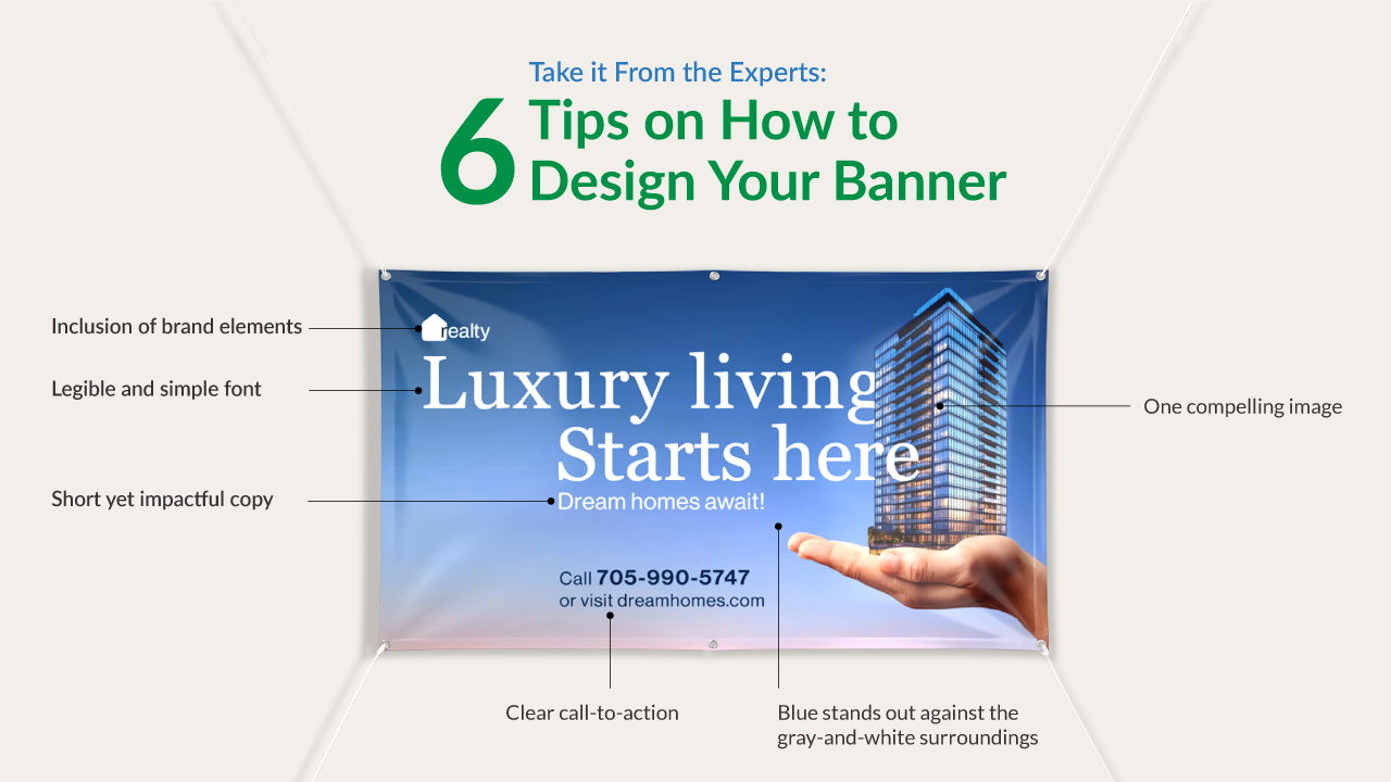
1. Start With a Clear Objective.Digital Room’s Art Director of Digital Media, KD Macalinao, has learned from her 12 years in graphic design that every great work begins with a clear goal. “Laying the groundwork is the first step to effective banner designs,” KD says. She recommends asking yourself four questions about the banner to clarify your objective:
- What’s the purpose of this banner?
- Who is the banner for?
- Where will the banner be placed?
- How will the banner be viewed?
Once you’ve answered all these questions, you can better articulate the banner’s purpose and design it around your target audience.
2. Less is More.“Keep the text short, don’t use too many colors and too many fonts, and don’t add unnecessary embellishments.” KD recommends these basic banner design tips if you want your sign to deliver quick and easy-to-understand information.
KD also emphasizes the importance of giving your banner breathing space or white space. When there’s enough space between the elements, like text and images, readers can understand the core message easily.

3. Do not Use Illustrative Fonts.
Your banner should be easy to read from any distance. Digital Room’s Senior Creative Director Greg Simmons — who leads the company’s Visual Design, UX Brand, and Content Teams — advises designers to stay away from any font that looks like it was drawn or painted by an illustrator. Some examples to avoid are “fonts that have leaves coming out of it” or “brush stroke font types.” These fonts will turn your reader off from looking at the rest of the banner.
4. Choose Banner Colors that are Different from its Surroundings.
Visit your banner’s display location and take note of the dominant or similar colors that will surround the sign. “Part of your banner’s color decision is that it should be different from what’s around it,” Greg explains. Potential customers are likelier to see your display from a distance if its colors distinguish your banner from the surrounding signs and object
You’ll also want to account for other factors when finalizing your banner’s colors. Greg suggests asking a few questions to figure out your options:
- From what point of view will people see the sign?
- Will they be walking up to the banner, or will they be seeing it from afar?
Getting a good idea of your banner’s would-be location will help you choose the right proportions for your display ad.
5. Include a Clear and Concise Call-to-Action.Signs.com co-founder Nelson James considers call-to-action a banner’s essential feature. “The banner should have a clear and concise call-to-action that tells viewers what you want them to do,” he says. It could be anything from visiting your website, attending an event, or scanning a QR code. Make sure this action is prominently displayed and easy to understand.

6. Use Branding Elements Consistent with your other Promotions
The branding elements on your banner should be consistent with what’s seen on other promotions. Nelson encourages keeping the logo, colors, and fonts the same across the different marketing channels. “This will help with brand recognition and make your banner more memorable,” he says.

Create Your Own Custom Banners Today
Remember, effective banner designs are critical to the success of your marketing and promotional campaign. Now that you know where to begin, check out the different banners you can design with Signs.com. The site lets you create the design online or upload a file for banner printing.
A Little Bit About Our Banner Design Experts:
KD Macalinao. KD Macalinao has 12 years of design experience in print and digital marketing. She currently works as an Art Director at Digital Media at Digital Room, Inc.
Greg Simmons. Before he joined Digital Room, Inc., Greg led Design and Creative teams at top international agencies like R/GA, Rosetta, and SapientRazorfish. He helped develop award-winning digital and printed solutions for AT&T, IBM, KitchenAid, Zales, Hickory Farms, The Smithsonian, and Time Warner among others.
Nelson James. With over 15 years of experience in e-commerce and signages, Nelson currently provides leadership and expertise for all products under the banners and signs category for Signs.com where he is also a co-founder.
Related Articles
How to Add Safe Zones and Bleed Areas in Adobe Photoshop and Adobe Illustrator
Signage 101 – How to Hang Your Banner
Vinyl Banner Design Tips & Ideas
Standard Banner Sizes: How to Choose the Right Banner Size for Your Location
How to Design a Reusable Banner That Works Year After Year
You may have certain rights with respect to the personal information we collect and process. These rights vary by state and country and depend on your residency. These rights are not absolute and we reserve all of our rights available to us at law in this regard. Please complete the below form to exercise one of your data subject rights, where applicable. We will process your request within the time provided by applicable law.