Visual hierarchy is simply the order in which people see and understand information. It’s how your design tells the eye where to look first, what to focus on next, and what to remember.
Outdoors, this matters more than anywhere else. People are often moving, distracted, or viewing your sign from a distance. You don’t get time to explain. Your design has to communicate instantly. A strong visual hierarchy turns a sign into a quick, clear message. A weak one turns it into noise.
What is Visual Hierarchy in Design?
Visual hierarchy is a set of hierarchy design principles used to organize content so viewers naturally follow a specific reading order.
The goal is simple: guide the viewer’s eye from the most important element to the least important, without confusion.
Every effective outdoor sign should answer three questions immediately:
- What should I read first?
This is your headline or primary message.
- What matters most?
Supporting details like offers, location, or key benefits.
- What should I do next?
A call to action such as “Call Now,” “Visit Today,” or directional cues.
If your design doesn’t clearly answer these, people will move on before they figure it out.
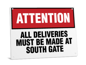
The Core Elements of Visual Hierarchy for Outdoor Displays
Size and Scale
Size is the strongest signal of importance. Larger elements get seen first.
- Headlines should be significantly larger than supporting text
- Avoid making everything “big” or nothing stands out
- Use clear size steps (headline > subhead > details)
Contrast
Contrast ensures your message is readable at a glance.
- Use strong light-dark combinations (e.g., black on white, white on dark blue)
- Avoid low-contrast pairings like yellow on white or gray on black
- Make sure text stands out clearly from the background
Color
Color helps direct attention and organize information.
- Use color to highlight key elements (like calls to action)
- Limit your palette to avoid visual overload
- Balance brand colors with readability needs
Typography
Typography affects both readability and tone.
- Stick to 1 – 2 font families
- Favor clean, legible fonts (sans serif are often used for signage meant to be viewed from a distance)
- Use weight (bold, regular) to create emphasis
- Avoid overly decorative or thin fonts outdoors
Spacing and White Space
White space improves clarity by giving elements room to breathe.
- Increase spacing around important elements
- Avoid cramming text edge-to-edge
- Use margins to frame your message
Alignment and Layout
Alignment creates structure and flow.
- Keep text aligned consistently (left, center, or right)
- Use simple layouts that guide the eye naturally (top to bottom or left to right)
- Avoid random placement of elements
Proximity
Group related items together so they’re understood as one unit.
- Keep headlines close to supporting text
- Separate unrelated information clearly
- Use spacing to show relationships between elements
Imagery and Icons
Visuals should support — not compete with — your message.
- Use images that reinforce the main idea
- Avoid overly detailed or distracting graphics
- Keep icons simple and recognizable
Designing for Distance: Readability Rules of Thumb
Why Distance Changes Everything Outdoors
Outdoor signage isn’t read up close. People might be walking, driving, or passing by quickly. That means your message must be readable from a distance and in seconds.
General Font Size Guidelines
A common rule of thumb:
- 1 inch of letter height ≈ 10 feet of viewing distance
Examples:
- 3-inch letters → readable at ~ 30 feet
- 6-inch letters → readable at ~ 60 feet
- 12-inch letters → readable at ~ 120 feet
Always scale your headline for the farthest expected viewer.
Headline vs. Secondary Text
- The headline should be readable at maximum distance
- Supporting text can be smaller but still legible at mid-range
- Fine print rarely works outdoors — keep it minimal or remove it altogether
Viewing Scenarios
Different environments require different hierarchy approaches:
- Pedestrian signage: More detail allowed, but still concise
- Roadside signage: Large text, minimal words
- Event or trade show displays: Designed for mid-range viewing and quick scanning
Legibility Tips
- Use bold, clean fonts
- Keep wording short (5 – 7 words for headlines)
- Prioritize clarity over creativity
- Test readability by stepping back or zooming out
Environmental Factors That Affect Hierarchy
Lighting and Glare
- Direct sunlight can wash out colors
- Glossy finishes may reflect light and reduce readability
- Choose high-contrast designs to compensate
Weather Conditions
- Rain, fog, and dust can reduce visibility
- Strong contrast and simple layouts hold up better in poor conditions
Wind and Movement
- Banners may shift or ripple, distorting text
- Keep key information centered and large
- Avoid placing critical details near edges
Obstructions and Placement
- Signs may be partially blocked by poles, trees, or vehicles
- Place key messages where they’re least likely to be obstructed
- Consider viewing angles and approach direction
Designing With Constraints in Mind
The best outdoor designs anticipate real-world conditions, not just ideal ones. Always design for visibility in less-than-perfect situations.
Common Outdoor Display Mistakes to Avoid
- Too many focal points
Everything competes, so nothing stands out
- Low contrast color combinations
Makes text hard to read, especially in sunlight
- Overloading with text
People won’t read paragraphs outdoors
- Using too many fonts or styles
Creates visual confusion
- Edge-to-edge clutter
No breathing room reduces clarity
- Ignoring viewing distance
Text ends up too small to read
- Poor placement in real-world environments
Even a good design fails if it’s not visible
A Simple Framework: How to Build a Clear Hierarchy
Follow this step-by-step process:
1. Define the single most important message
What must people understand instantly?
2. Identify supporting details (max 2–3)
Only include what adds value
3. Assign visual weight
Use size, color, and placement to prioritize elements
4. Test at distance
Zoom out on your screen or print a draft and step back
5. Simplify until instantly understandable
If it takes more than a few seconds to grasp, refine it
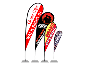
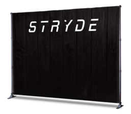
Applying Hierarchy Across Common Outdoor Sign Types
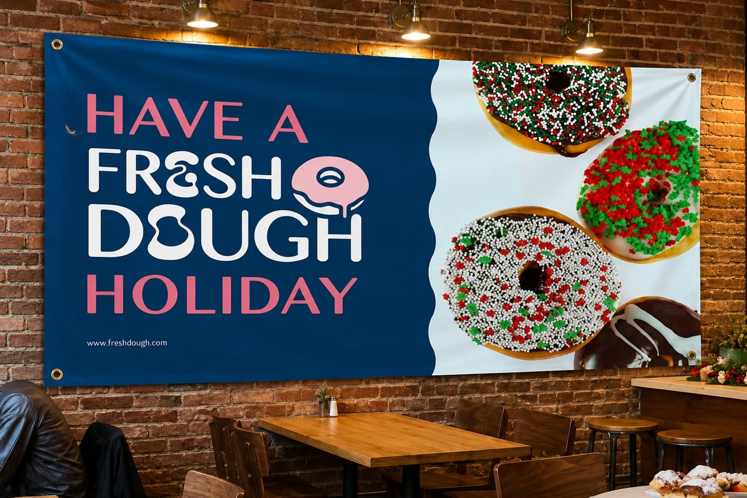
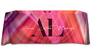
Banners
- Focus on one bold message
- Use large headlines and minimal supporting text
- Ensure readability even when the material moves
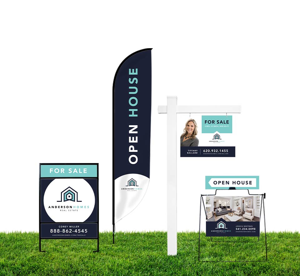
Yard Signs
- Prioritize quick readability for passing viewers
- Keep messaging short and bold
- Use strong contrast and simple layouts
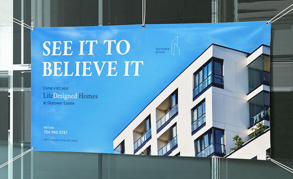
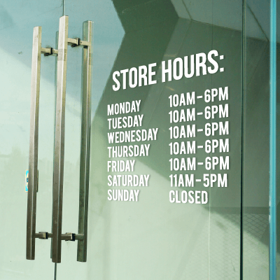
Storefront Signage
- Balance branding with clarity
- Ensure visibility from across the street
- Highlight key information like name or offering
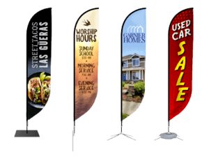
Trade Show Displays
- Design for mid-range viewing and quick scanning
- Use hierarchy to guide visitors from headline to details
- Keep messaging structured and easy to digest
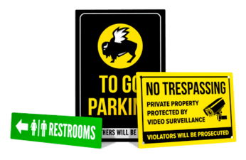
Wayfinding and Directional Signs
- Clarity is critical
- Use arrows, icons, and minimal text
- Make directions instantly understandable at a glance
Good visual hierarchy isn’t just about making a design look better, it’s about making it work better. When your signage is clear, readable, and structured, people can understand your message quickly and act on it without effort. In outdoor environments where attention is limited and distractions are everywhere, that clarity is what turns a sign into something effective rather than something ignored.