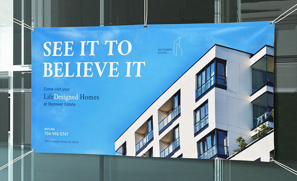
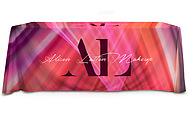
Whether you’re planning an event, launching a new product, or simply amplifying your brand’s visibility, using a banner is one of the most effective ways to grab attention in a busy location.
It’s important to note that the print quality of banners and other large-format marketing tools depends on the quality and format of the files. So, before you send your design files for production, make sure they meet your print service provider’s requirements.
In this guide, we learn about the best practices and standard requirements when preparing your files for banner printing.
1. Choose the Right Size and File Orientation
The ideal file size for banner printing can vary and may depend on the size of the actual banner. However, large files are highly recommended to achieve rich colors and sharp details. It is also ideal to set your file to the final print size and save it as a print-ready PDF to ensure accurate color reproduction, vibrant images, and crisp, sharp text.
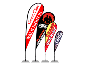
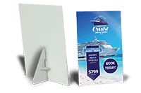
The right orientation, meanwhile, depends on the design of your banner and where you’ll install it. In general, landscape banners suit outdoor spaces and wide walls, while portrait banners and roll-ups work on tight spaces, such as trade show booths and retail aisles.
2. Understand Your Banner’s DPI Requirements
In printing, DPI (Dots Per Inch) refers to the number of tiny ink dots a printer places per inch of material, which could be vinyl, paper, or fabric. The higher the DPI, the sharper and more detailed the image, graphics, and text will appear on the banner.
The recommended resolution depends on the banner’s size and viewing distance. When printing banners and large-format prints, 150–300 dpi is the standard used by most printers.
3. Convert All Artwork to CMYK Color Mode
Always convert your file to CMYK color mode when printing materials to ensure accurate color reproduction. Printers use CMYK (Cyan, Magenta, Yellow, Black) to produce color; they subtract light as they apply ink to the material. By contrast, digital screens create colors by emitting light and using the RGB (Red, Green, Blue) color model.
Because of this difference, printers may not print RGB colors accurately. If you submit an RGB file, the printer or software will convert it automatically, often resulting in unpredictable color shifts. Converting your file to CMYK yourself allows you to preview and adjust colors before printing.
For additional design tips and best practices, check out this article on banner printing guidelines.
4. Follow Print Guidelines Like Bleed and Trim Lines
In layout design templates, bleed, trim lines, and safe zones exist to ensure your banner looks clean and professional after production.
Bleed is the area of background or artwork that extends beyond the final trimmed line, typically by 0.125 inches (3 mm) on all sides, to ensure that colors and images reach the very edge of the paper, preventing unsightly white borders.
Trim line indicates where the printer will cut the banner to its final size. This print guideline prevents uneven edges or cut‑off design elements.
Safe zone keeps important content such as text, images, and logos away from the edges, preventing critical details of the banner from being trimmed during the production process.
5. Check for Spelling Errors
Banners are designed to be eye-catching and visible from afar, so spelling mistakes stand out more. A single typo — especially in a headline, brand name, URL, or phone number — can significantly reduce their effectiveness and even damage brand credibility.
Always double‑check text, especially dates, URLs, contact information, and brand names. It’s best practice to have at least one other person proofread the design and content before sending the file to the printer.
6. Test QR Codes Before Printing
Banners are usually seen briefly as people walk or drive past them, which is why QR codes have become a popular design element in recent years. These machine-readable barcodes can direct people to websites, online stores, registration pages, maps, or menus.
Always test your QR code on multiple devices and at varying distances before printing. Once a banner is printed, any error is permanent and costly to fix.
Common Banner Printing Mistakes (and How to Address Them)
Here are the most common banner printing mistakes and the corresponding solutions to prevent them from happening in the first place.
1. Using Poor-Quality Images
Low‑resolution images may look acceptable on screen but appear blurry and pixelated when printed.
Solution:
- Use images at 150–300 dpi at full print size.
- Use vector graphics, as they remain sharp at any size.
- Save files as PDF, TIFF, or EPS to prevent compression that causes blurriness.
2. Text Too Small or Hard to Read
The ideal font size for your banner depends on its viewing distance. For small, indoor displays, they are typically viewed from 3-4 feet, while large outdoor promotional banners are often viewed from 20-60 feet.
Solution:
- Design based on the viewing distance — the farther the viewer, the larger the text on a banner.
- The general recommendation is to use 1 inch of letter height per 10 feet of viewing distance. For example, 72-96 pt. font size typically suits smaller indoor displays, while 360-460 pt. letter height is ideal for oversized outdoor banners.
- Keep copy short, bold, and simple. Banners are skimmed, not read.
3. Ignoring Outdoor Elements
The right material, accessories, and installation method will depend on the banner’s location. Long-term outdoor displays need to be weather-resistant and more durable than indoor promotional banners that are not exposed to harsh weather conditions.
Solution:
- In windy locations, print your banners using mesh vinyl.
- Choose banners printed on heavy-duty vinyl if they are intended for long-term outdoor display. Check out this article for more information on the ideal materials and accessories for banners.
- Order banners with proper grommet spacing and reinforced hems.
4. Placing Text Too Close to the Edges
Text or logos placed too close to the edges may be cut off or obstructed by mounting hardware, such as grommets and pole pockets.
Solution:
- Keep important content within a 1–2-inch safe margin.
- Account for hems, grommets, and pole pockets when designing your banner.
- Use layout templates with print guidelines like safe margin, trim line, and bleed.
Proper file preparation ensures the final printed banner looks exactly as you intended — appealing to the target audience, professional-looking, and readable based on its intended viewing distance. It also ensures the production process runs smoothly, with no delays from last-minute fixes or redesigns.