
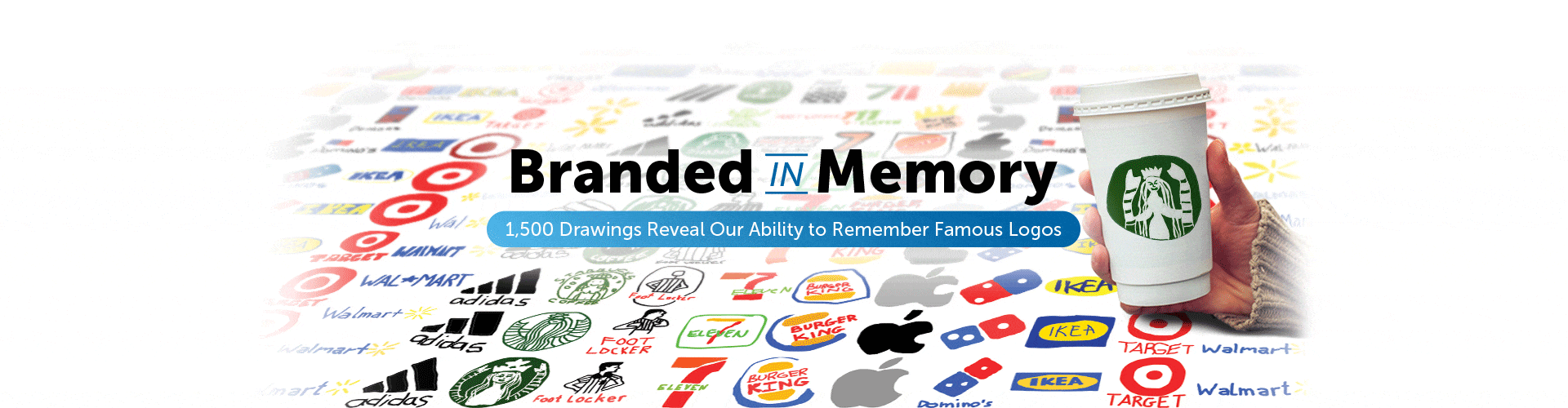

10 iconic logos. 156 Americans. 80 hours of drawing from memory.
The logos of global corporations like Apple, Starbucks, and Foot Locker are designed to create instant brand associations in the minds of billions who see them every day. But how accurately can we remember the features and colors of these famous symbols?
To find out, we asked over 150 Americans to draw 10 famous logos from memory as accurately as they could. Based on more than 1,500 drawings created over a period of 80 hours, the results reveal that, far from being stamped perfectly in our collective memory, these ubiquitous emblems largely exist as fuzzy visions in our mind's eye. One in 5 people thinks the Foot Locker referee wears a hat (he doesn't), and nearly half of people believe the Starbucks mermaid does not wear a crown (she does). That only scratches the surface of what our study found out.
Choose from the logos below to jump to individual results, or read a summary of all findings here.
Jump to a Section
Apple


There are Apple devices in the pockets, on the wrists, and otherwise in the possession of around 600 million people across the world.1 With so many opportunities to see it each day, recalling Apple's elegantly simple logo should be a no-brainer, right? After all (and unlike Starbucks or Foot Locker), the clue to its design is in the name!
In fact, only 20 percent of people were able to draw the Apple logo almost perfectly. To qualify as nearly perfect, all key features (e.g., the bite, the floating leaf, and the overall shape and proportions) had to be combined accurately.


The most common mistake, made by nearly 1 in 3 people, was including a stalk, when in reality there isn't one. There is, however, a leaf, and although 15 percent drew it facing the wrong direction, three-quarters of people remembered to include it in one form or another.
The Apple logo as we know it today was designed by ad agency Regis McKenna in 1977.2 Art director Rob Janoff's challenge was to make the emblem more businesslike (it had previously shown Isaac Newton sitting under an apple tree) and, as Steve Jobs put it, "don't make it cute." The bite, which is the logo's most iconic feature, was included for scale, so the apple wouldn't be mistaken for a cherry.


Eighty-four percent of people remembered the bite, but over 1 in 5 mistakenly drew it on the left side instead of the right.
Interestingly, a smaller proportion of people in our experiment put the bite on the wrong side of the apple (22 percent) than the proportion who, in a now famous experiment in visual memory conducted in 1979, thought Abraham Lincoln faced left on a U.S. penny (50 percent)3, when in fact he faces right. So when it comes to saying which way Abe faces on a penny, our guesses are no better than the toss of a coin, but when asked which side of the apple has the bite, we're right almost 80 percent of the time.
Of 156 people, five (3 percent) drew the logo as rainbow-striped, which reflects how it looked between 1977 and 1998.4 Their average age was 42, compared to an average age of 34 across all participants. So it's possible they remembered the logo as it was when they were in their 20s.
Six percent colored the logo red (perhaps thinking of a regular red apple), while 72 percent correctly identified it as black or gray.


Adidas
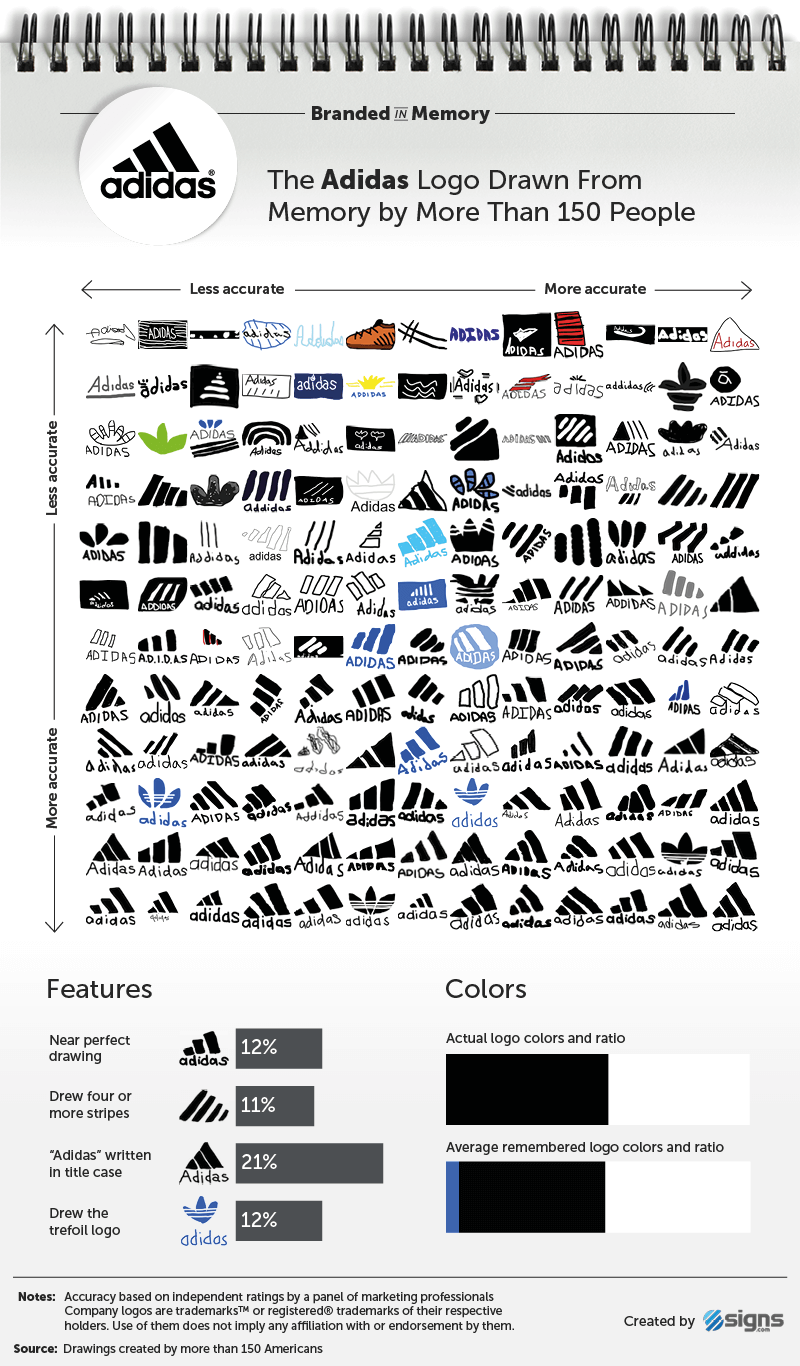

Adidas, the second largest sportswear company in the world, acquired its three-stripes logo in 1952 from footwear brand Karhu Sports for two bottles of whiskey and the equivalent of $2,000.5 Sixty-five years later, the iconic stripes are featured on the clothing of hundreds of professional athletes and hundreds of millions of consumers.


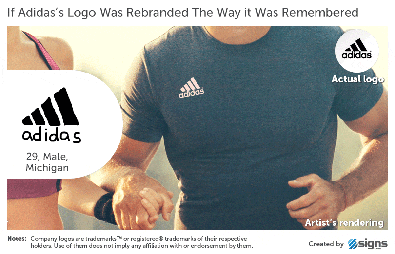
Despite its ubiquity, only 12 percent of people in our study created near perfect renditions of the Adidas logo from memory. That meant recalling it has three stripes (not four or more, as 11 percent of participants believed), that the word "adidas" is written entirely in lowercase (21 percent used a capital "A"), and that the logo does not, as one participant imagined, consist of a brown boot facing left.


Roughly 1 in 10 people drew the Adidas trefoil logo, which was introduced in 1971.5 Its three leaves are intended to represent the landmasses of the Americas, Europe, Africa, and Asia, and the three lines connecting them signify diversity. The trefoil logo is still used on some of the company’s products, particularly the Adidas Originals line.
The Adidas logo is usually black, but 8 percent of people included blue in their drawings, which, while not the logo's primary color, is used extensively in Adidas' packaging, especially on their blue footwear boxes.

Burger King


In contrast to the minimalistic and monochromatic Apple and Adidas icons, Burger King's logo is slightly more complex, consisting of three distinct features (text, bun halves, and a crescent shape) and three colors (red, yellow, and blue). As a result, we expected the accuracy of our participants' recollections to drop. However, the additional colors didn't seem to put any extra strain on their memories.

Eighteen percent of people were able to recall Burger King's logo almost perfectly, compared to 20 percent for Apple and 12 percent for Adidas.
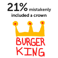
One of the most interesting results of our experiment is that people often mistakenly remember elements of a brand's wider advertising as being part of its logo. Twenty-one percent of people included a crown, despite Burger King’s logo not featuring one since its “sitting king” logo, which was in use from 1957 to 1969.6


It seems unlikely that our participants, with an average age of 34, recalled a defunct logo from 48 years ago instead of the current version, which has been around since 1999. It's more likely that they couldn't fully remember what the logo looks like, so they included a crown in response to the word "King" in the brand's name, the King character from its ads, and the paper crowns that are given out in restaurants.
It's less clear why over 1 in 5 people drew Burger King logos that look almost identical to the version used between 1969 and 1999, which consisted of red text and orange bun halves, but no blue crescent or "axis tilt." Our theory is that some of these participants probably did remember the old logo, while others tried to draw it in its current form but forgot a couple of key features.


Domino's


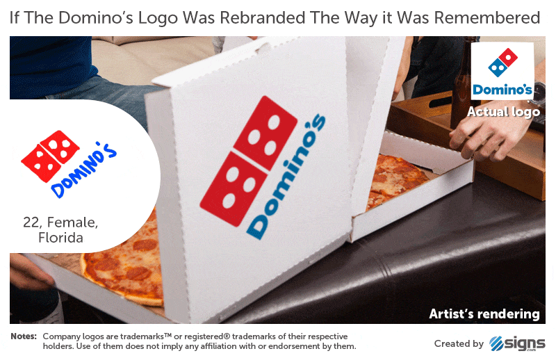
The three dots featured on the original Domino's Pizza logo represented the first three stores owned by founders Tom and James Monaghan in the 1960s. The plan was to add a dot for each additional store that opened, but rapid growth quickly made the idea impractical, so the three dots were left untouched.7


Twenty-eight percent of people recalled that the Domino's logo has three dots and positioned them correctly (two in the bottom square, one in the top). Thirty-seven percent included more than three dots, while 14 percent forgot them altogether.
Overall, 16 percent drew near perfect Domino's logos, and 28 percent made good attempts, meaning their versions closely matched the actual logo except for a few minor mistakes.
We saw above that a large proportion of people appeared to draw an older version of the Burger King logo, but it wasn't clear whether they actually meant to. In Domino's case, it was more clear-cut.


Fifteen percent of people drew what was unmistakably the square, tilted Domino's logo used between 1996 and 2012. Sampling the colors used in the 156 drawings also shows that the average remembered shade of blue is closer to the royal blue used in the older Domino's logo than the sky blue utilized today.
Two-thirds of our participants included the brand name in their drawings, although not always with perfect accuracy: 55 percent forgot to include the apostrophe, and 11 percent included an "e": Dominoe's.

7-Eleven

The 7-Eleven logo hasn't changed much since it first appeared in 1946. It is characterized by a numeral seven that is intersected by the word "Eleven" and set inside a white trapezoid against a green background. The only major change came in 1969 when the top part of the "7" was made orange while the bottom remained red.8


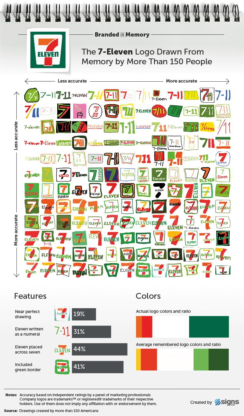
Nineteen percent of people drew near perfect 7-Eleven logos, and 46 percent closely matched the actual logo except for some minor flaws. Two of the most common mistakes were writing "Eleven" as a numeral (31 percent), and positioning the word "Eleven" underneath the "7" instead of across its middle (56 percent).


One of the most subtle features of the 7-Eleven logo is that "eleven" is written "ELEVEn" – in uppercase except for the letter "n." Only two in 156 people (around 1 percent) correctly remembered this minor detail. We wondered if they were 7-Eleven employees, but further investigation showed that, while one does work in wholesale and retail, both said they only engage with the 7-Eleven brand "very rarely" or "occasionally."
It seems that, despite remaining almost completely unchanged for nearly 50 years, the 7-Eleven logo has too many elements that can be mixed up or omitted in people's minds, as it was only the fourth most accurately remembered logo out of the 10.

Foot Locker


Foot Locker and Starbucks are the only brands in our experiment whose logos feature people. They were also the two least accurately recalled, which suggests that figures in logos add a level of complexity that most people struggle to recollect. In Foot Locker's case, the person featured is a referee with his hands on his hips, facing right (as we look at him), with "Foot Locker" written in red text underneath.
The logo has been in use since 1988, but it isn't featured on the front of every Foot Locker store, which now number more than 3,300 globally.9 Quite often storefronts only display the brand name in red text, while the referee can more reliably be seen on Foot Locker's shopping bags.


Nevertheless, 57 percent of people included the referee in their drawings of the Foot Locker logo, with half remembering his hands are on his hips and 60 percent showing him facing in the correct direction (again, more than the proportion of people who knew the direction in which Abraham Lincoln faces on a penny).
Only 8 percent of participants drew a near perfect Foot Locker logo from memory, which made it the second most poorly remembered logo of the 10 we tested. It seems there were too many ways for people to slip up, including putting a baseball hat on the referee (18 percent), drawing a striped referee's shirt without the referee himself (9.7 percent), or just being too literal by drawing an actual shoe or foot (14 percent).


Starbucks


Since its formation in 1971, Starbucks has used three logos, each showing a different rendition of a twin-tailed mermaid (or siren, as she's known in Greek mythology). In the first version of the logo, the mermaid was topless, but in 1987 the logo was simplified by covering her breasts with flowing hair and switching the main color from brown to green.


Starbucks' current logo, introduced in 2011, is a streamlined version of the two-tailed siren. It no longer features the "Starbucks Coffee" text and is pure green, as opposed to green and black. Despite this simplification, only 6 percent of people drew a near perfect Starbucks logo from memory.
There's no doubt that the Starbucks mermaid is extremely memorable (90 percent of people included her), but she's complex enough for very few people to recall the details of her form accurately.


Of people who drew the Starbucks mermaid, 45 percent forgot that she wears a crown, 16 percent who drew her crown remembered the star in its center, and 55 percent omitted her twin tails.
Thirty-one percent of people remembered the pre-2011 Starbucks logo, which featured the brand name and a black circle.
Overall, despite the fact that Starbucks sells around 18 million cups of coffee each day,10 the finer details of the mermaid made its logo the least accurately remembered of all the brands we investigated.

Walmart


Walmart is the world’s largest company by revenue, with more than 11,500 stores in 28 countries.11 Its first logo, used between 1962 and 1964, was as basic as logos come, consisting of plain sans-serif lettering and no symbols. The typeface then changed to the "Frontier Font," resembling something from the Wild West, before reverting to plain lettering in 1981, although still with a hyphen between “Wal” and “Mart.” One in 10 people used a hyphen in their drawings.
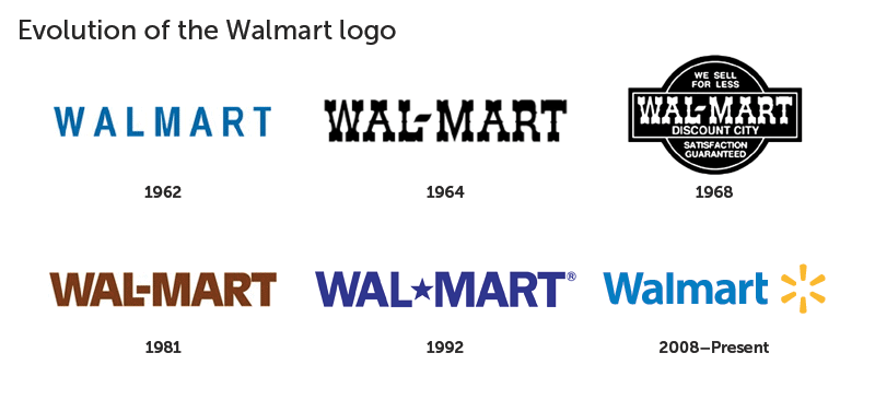

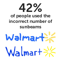

In 1992, a star replaced the hyphen (7 percent of our participants included this defunct star in their drawings), until 2008, when Walmart made the logo friendlier and more welcoming by removing the hyphen, making the text title case and including a "sunburst" symbol. Sixty-eight percent of people remembered the sunburst symbol, although 42 percent of the time they didn’t draw it with the correct number of points (six), arranged in the proper fashion.
Twelve percent of people drew a near perfect Walmart logo from memory, indicating that it is less clearly recalled than 7-Eleven (19 percent) but equal to Adidas.
In terms of color and text, the Walmart logo is very simple. But the sunburst symbol is exactly the sort of thing people fail to recall accurately. Remembering the presence of the sunburst is easy, but there is enough complexity to it that many people get confused by the number and arrangement of the beams. This was the most common reason drawings failed to be near perfect, followed by confusing old and new versions of the logo. This was more the case for Walmart than any other brand. People confused the star and the sunburst – from the brand’s two most recent logos – either including both at the same time, placing the sunburst where the star used to be, or vice versa.


This was the most common reason drawings failed to be near perfect, followed by confusing old and new versions of the logo. This was more the case for Walmart than any other brand. People confused the star and the sunburst – from the brand’s two most recent logos – either including both at the same time, placing the sunburst where the star used to be, or vice versa.


Target


Alongside Walmart, Target is one of the country’s biggest mass-merchandise retailers. Its logo is one of the most recognizable, too. According to a 2003 Target study, 96 percent of North Americans associated the bold, red bull's-eye symbol with the retailer.12


In our experiment, one-quarter of people drew near perfect Target logos from memory, making it the second best remembered. Fifty-two percent were able to draw it well (a close match except for a few minor flaws).


The main aspect of the logo to get right is its color (100 percent of people knew the bull's-eye was red) and the number of rings that comprise the target. Fifty-nine percent of people knew the actual logo has a solid circle in its center and one ring surrounding it.
Most people (59 percent) chose to include the word "Target," which is how it’s commonly seen on storefronts. However, those who missed out the brand name weren’t completely wrong, as Target has decoupled the name from its logo in ads and flyers since 2006, believing that most people are familiar enough with the brand to make the association easily.


IKEA


The most accurately drawn logo from memory by 156 Americans belongs to a Swedish company: IKEA.


Thirty percent of the people who drew the IKEA logo from memory were able to recreate its combination of text, shapes, and color almost perfectly, compared to 25 percent for Target, and 20 percent for Apple.


One of the most important elements of the IKEA logo, given that it is so simple, are the letters. Eighty-eight percent of people remembered that they are written in uppercase. Whether you remember the IKEA logo with or without the yellow oval behind the blue letters depends on if you think of an IKEA storefront, which is likely to feature yellow letters on a blue background, or the logo from printed materials and TV commercials, which shows the oval. Forty-one percent of drawings included the oval behind the brand name.


Summary
The question at the heart of this experiment is "How accurately can we recall logos we see on a daily basis?" The results show that most people are very good at recalling brand colors – around 80 percent selected the correct palettes for their drawings, while shapes and elements in logos are harder to recall.
When a brand’s logo changes over time, a subset of people mistakenly conflates old and new versions. Similarly, we sometimes slip up when advertising utilizes strong symbols not used in the logo (e.g., the Burger King crown).
Overall, 16 percent of people drew near perfect logos, and 37 percent were good but not perfect. As we would expect, the more complex the logo, the less likely people are to remember it in full.

We wanted to go deeper than just measuring the accuracy of each remembered logo, so we asked our 156 participants a host of questions about themselves, including their age, gender, occupation, and how much they engage with the 10 brands (e.g., owning an Apple device or regularly shopping at Target). Men and women performed equally well (or poorly), regardless of the logo in question, and their level of brand engagement made no difference to their ability to accurately recall the logos.
There was, however, a difference by age. On average, younger people drew more accurate logos than older people. This was true across almost all brands, but was most noticeable for 7-Eleven, Burger King, and Adidas. Walmart was least affected by age, showing no difference between younger and older groups.
Our participants’ drawings were scored twice. First by the participants themselves, then by an independent panel of five design and advertising professionals, who assessed the presence of key features and dimensions, as well as the colors used. The judges’ scores were averaged to establish ratings for over 1,500 drawings. This allowed us to compare the drawers' self-perceived accuracy to the actual accuracy as judged by other people. In other words, we could measure under and overconfidence.

Seventy percent of our participants overrated the accuracy of their attempts. The average accuracy of the drawings as judged by the participants was 5.3 out of 10, while the average rating of the same drawings by our independent judges was 3.8. Confidence scaled with accuracy, so while people in general overestimated how well they did, those who did best had the best awareness of their ability.
How can logos from companies as ubiquitous as Apple, Starbucks, and Walmart be so hard to pin down in our mind’s eye?
One explanation is that, as Sherlock Holmes said, we "see, but do not observe." Logos of giant corporations are so widespread that we don't need to have a photographic memory of them to recognize and engage with these brands. Instead, we remember just enough to get by. This process has been dubbed "inattentional amnesia" – despite seeing something many times, we fail to create a lasting memory of it. We found this to be the case even when participants engaged with the brands more than average.
We’ve seen how – despite our self-confidence – our ability to remember logos is surprisingly fallible. Perhaps you think you would have fared a little better. If so, we'll finish by asking you a very simple question: What color is the second letter in Google’s logo?
Logo Gallery
150 people Draw 10 Logos from Memory
Less Accurate
More Accurate
Select a Logo
Company logos are trademarksTM or registered® of their respective holders. Use of them does not imply any affiliation with or endorsement by them.
To embed this interactive gallery on your site, use this code:
< iframe width="576" height="500" scrolling="no" frameborder="0" src="https://ec2-52-36-103-254.us-west-2.compute.amazonaws.com/logoslider/">
Methodology
-
We recruited 156 Americans ranging in age from 20 to 70 to take part in our drawing experiment, with an average age of 34. Fifty percent were female, 47 percent were male, and 3 percent preferred not to say.
-
Our participants collectively spent 80 hours (31 minutes each) drawing the 10 logos using only their memories. Each person was taught how to use the drawing software to maximize their ability to draw accurately. They were asked to rate each of their attempts for accuracy out of 10, as well as indicate their level of engagement with the respective brand.
-
Logos were also independently rated for accuracy by a panel of five design and marketing professionals. Each gave the over 1,500 drawings a score out of 10 based on the included features, proportions, and color palettes. The scores were then averaged to establish accuracy ratings for each drawing and participant.
About Signs.com
Fascinated by the impact of logos on culture and human psychology? Us too! Signs.com is a team of design and tech nerds providing customers with the signage, practices, and education they need to get noticed. We offer more than just custom signs, though. Our superior customer service, easy-to-use design tools, and world-class materials will help you make your logo, brand, and company as memorable as possible.
Sources
1. http://uk.businessinsider.com/credit-suisse-estimates-588-million-apple-users-2016-4
2. https://www.creativereview.co.uk/apple-logo-1977/
3. http://www.sciencedirect.com/science/article/pii/0010028579900136
5. http://www.creativebloq.com/logo-design/how-adidas-logo-earned-its-stripes-11135390
6. http://logos.wikia.com/wiki/Burger_King
7. http://logos.wikia.com/wiki/Domino%27s
8. http://logos.wikia.com/wiki/7-Eleven
9. U.S. Securities and Exchange Commission filings, January 2017
10. https://www.facebook.com/starbuckspartners/videos/10155429344291002/
11. http://money.cnn.com/2016/06/02/news/companies/walmart-smiley/index.html
12. https://corporate.target.com/article/2014/04/bullseye-love-history-of-target-logo
Fair Use Statement
Want to share our research? Go for it! You’re welcome to share as long as it’s for noncommercial purposes, and you link back to us here!
10 iconic logos. 156 Americans. 80 hours of drawing from memory.
The logos of global corporations like Apple, Starbucks, and Foot Locker are designed to create instant brand associations in the minds of billions who see them every day. But how accurately can we remember the features and colors of these famous symbols?
To find out, we asked over 150 Americans to draw 10 famous logos from memory as accurately as they could. Based on more than 1,500 drawings created over a period of 80 hours, the results reveal that, far from being stamped perfectly in our collective memory, these ubiquitous emblems largely exist as fuzzy visions in our mind's eye. One in 5 people thinks the Foot Locker referee wears a hat (he doesn't), and nearly half of people believe the Starbucks mermaid does not wear a crown (she does). That only scratches the surface of what our study found out.
Choose from the logos below to jump to individual results, or read a summary of all findings here.
Jump to a Section
Apple
There are Apple devices in the pockets, on the wrists, and otherwise in the possession of around 600 million people across the world.1 With so many opportunities to see it each day, recalling Apple's elegantly simple logo should be a no-brainer, right? After all (and unlike Starbucks or Foot Locker), the clue to its design is in the name!
In fact, only 20 percent of people were able to draw the Apple logo almost perfectly. To qualify as nearly perfect, all key features (e.g., the bite, the floating leaf, and the overall shape and proportions) had to be combined accurately.
The most common mistake, made by nearly 1 in 3 people, was including a stalk, when in reality there isn't one. There is, however, a leaf, and although 15 percent drew it facing the wrong direction, three-quarters of people remembered to include it in one form or another.
The Apple logo as we know it today was designed by ad agency Regis McKenna in 1977.2 Art director Rob Janoff's challenge was to make the emblem more businesslike (it had previously shown Isaac Newton sitting under an apple tree) and, as Steve Jobs put it, "don't make it cute." The bite, which is the logo's most iconic feature, was included for scale, so the apple wouldn't be mistaken for a cherry.
Eighty-four percent of people remembered the bite, but over 1 in 5 mistakenly drew it on the left side instead of the right.
Interestingly, a smaller proportion of people in our experiment put the bite on the wrong side of the apple (22 percent) than the proportion who, in a now famous experiment in visual memory conducted in 1979, thought Abraham Lincoln faced left on a U.S. penny (50 percent)3, when in fact he faces right. So when it comes to saying which way Abe faces on a penny, our guesses are no better than the toss of a coin, but when asked which side of the apple has the bite, we're right almost 80 percent of the time.
Of 156 people, five (3 percent) drew the logo as rainbow-striped, which reflects how it looked between 1977 and 1998.4 Their average age was 42, compared to an average age of 34 across all participants. So it's possible they remembered the logo as it was when they were in their 20s.
Six percent colored the logo red (perhaps thinking of a regular red apple), while 72 percent correctly identified it as black or gray.
Adidas
Adidas, the second largest sportswear company in the world, acquired its three-stripes logo in 1952 from footwear brand Karhu Sports for two bottles of whiskey and the equivalent of $2,000.5 Sixty-five years later, the iconic stripes are featured on the clothing of hundreds of professional athletes and hundreds of millions of consumers.
Despite its ubiquity, only 12 percent of people in our study created near perfect renditions of the Adidas logo from memory. That meant recalling it has three stripes (not four or more, as 11 percent of participants believed), that the word "adidas" is written entirely in lowercase (21 percent used a capital "A"), and that the logo does not, as one participant imagined, consist of a brown boot facing left.
Roughly 1 in 10 people drew the Adidas trefoil logo, which was introduced in 1971.5 Its three leaves are intended to represent the landmasses of the Americas, Europe, Africa, and Asia, and the three lines connecting them signify diversity. The trefoil logo is still used on some of the company’s products, particularly the Adidas Originals line.
The Adidas logo is usually black, but 8 percent of people included blue in their drawings, which, while not the logo's primary color, is used extensively in Adidas' packaging, especially on their blue footwear boxes.
Burger King
In contrast to the minimalistic and monochromatic Apple and Adidas icons, Burger King's logo is slightly more complex, consisting of three distinct features (text, bun halves, and a crescent shape) and three colors (red, yellow, and blue). As a result, we expected the accuracy of our participants' recollections to drop. However, the additional colors didn't seem to put any extra strain on their memories.
Eighteen percent of people were able to recall Burger King's logo almost perfectly, compared to 20 percent for Apple and 12 percent for Adidas.
One of the most interesting results of our experiment is that people often mistakenly remember elements of a brand's wider advertising as being part of its logo. Twenty-one percent of people included a crown, despite Burger King’s logo not featuring one since its “sitting king” logo, which was in use from 1957 to 1969.6
It seems unlikely that our participants, with an average age of 34, recalled a defunct logo from 48 years ago instead of the current version, which has been around since 1999. It's more likely that they couldn't fully remember what the logo looks like, so they included a crown in response to the word "King" in the brand's name, the King character from its ads, and the paper crowns that are given out in restaurants.
It's less clear why over 1 in 5 people drew Burger King logos that look almost identical to the version used between 1969 and 1999, which consisted of red text and orange bun halves, but no blue crescent or "axis tilt." Our theory is that some of these participants probably did remember the old logo, while others tried to draw it in its current form but forgot a couple of key features.
Domino's
The three dots featured on the original Domino's Pizza logo represented the first three stores owned by founders Tom and James Monaghan in the 1960s. The plan was to add a dot for each additional store that opened, but rapid growth quickly made the idea impractical, so the three dots were left untouched.7
Twenty-eight percent of people recalled that the Domino's logo has three dots and positioned them correctly (two in the bottom square, one in the top). Thirty-seven percent included more than three dots, while 14 percent forgot them altogether.
Overall, 16 percent drew near perfect Domino's logos, and 28 percent made good attempts, meaning their versions closely matched the actual logo except for a few minor mistakes.
We saw above that a large proportion of people appeared to draw an older version of the Burger King logo, but it wasn't clear whether they actually meant to. In Domino's case, it was more clear-cut.
Fifteen percent of people drew what was unmistakably the square, tilted Domino's logo used between 1996 and 2012. Sampling the colors used in the 156 drawings also shows that the average remembered shade of blue is closer to the royal blue used in the older Domino's logo than the sky blue utilized today.
Two-thirds of our participants included the brand name in their drawings, although not always with perfect accuracy: 55 percent forgot to include the apostrophe, and 11 percent included an "e": Dominoe's.
7-Eleven
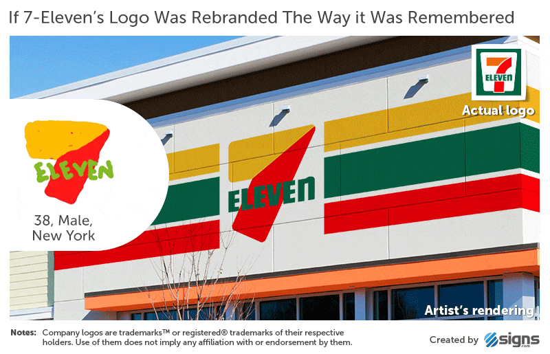
The 7-Eleven logo hasn't changed much since it first appeared in 1946. It is characterized by a numeral seven that is intersected by the word "Eleven" and set inside a white trapezoid against a green background. The only major change came in 1969 when the top part of the "7" was made orange while the bottom remained red.8
Nineteen percent of people drew near perfect 7-Eleven logos, and 46 percent closely matched the actual logo except for some minor flaws. Two of the most common mistakes were writing "Eleven" as a numeral (31 percent), and positioning the word "Eleven" underneath the "7" instead of across its middle (56 percent).
One of the most subtle features of the 7-Eleven logo is that "eleven" is written "ELEVEn" – in uppercase except for the letter "n." Only two in 156 people (around 1 percent) correctly remembered this minor detail. We wondered if they were 7-Eleven employees, but further investigation showed that, while one does work in wholesale and retail, both said they only engage with the 7-Eleven brand "very rarely" or "occasionally."
It seems that, despite remaining almost completely unchanged for nearly 50 years, the 7-Eleven logo has too many elements that can be mixed up or omitted in people's minds, as it was only the fourth most accurately remembered logo out of the 10.
Foot Locker
Foot Locker and Starbucks are the only brands in our experiment whose logos feature people. They were also the two least accurately recalled, which suggests that figures in logos add a level of complexity that most people struggle to recollect. In Foot Locker's case, the person featured is a referee with his hands on his hips, facing right (as we look at him), with "Foot Locker" written in red text underneath.
The logo has been in use since 1988, but it isn't featured on the front of every Foot Locker store, which now number more than 3,300 globally.9 Quite often storefronts only display the brand name in red text, while the referee can more reliably be seen on Foot Locker's shopping bags.
Nevertheless, 57 percent of people included the referee in their drawings of the Foot Locker logo, with half remembering his hands are on his hips and 60 percent showing him facing in the correct direction (again, more than the proportion of people who knew the direction in which Abraham Lincoln faces on a penny).
Only 8 percent of participants drew a near perfect Foot Locker logo from memory, which made it the second most poorly remembered logo of the 10 we tested. It seems there were too many ways for people to slip up, including putting a baseball hat on the referee (18 percent), drawing a striped referee's shirt without the referee himself (9.7 percent), or just being too literal by drawing an actual shoe or foot (14 percent).
Starbucks
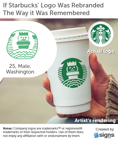
Since its formation in 1971, Starbucks has used three logos, each showing a different rendition of a twin-tailed mermaid (or siren, as she's known in Greek mythology). In the first version of the logo, the mermaid was topless, but in 1987 the logo was simplified by covering her breasts with flowing hair and switching the main color from brown to green.
Starbucks' current logo, introduced in 2011, is a streamlined version of the two-tailed siren. It no longer features the "Starbucks Coffee" text and is pure green, as opposed to green and black. Despite this simplification, only 6 percent of people drew a near perfect Starbucks logo from memory.
There's no doubt that the Starbucks mermaid is extremely memorable (90 percent of people included her), but she's complex enough for very few people to recall the details of her form accurately.
Of people who drew the Starbucks mermaid, 45 percent forgot that she wears a crown, 16 percent who drew her crown remembered the star in its center, and 55 percent omitted her twin tails.
Thirty-one percent of people remembered the pre-2011 Starbucks logo, which featured the brand name and a black circle.
Overall, despite the fact that Starbucks sells around 18 million cups of coffee each day,10 the finer details of the mermaid made its logo the least accurately remembered of all the brands we investigated.
Walmart
Walmart is the world’s largest company by revenue, with more than 11,500 stores in 28 countries.11 Its first logo, used between 1962 and 1964, was as basic as logos come, consisting of plain sans-serif lettering and no symbols. The typeface then changed to the "Frontier Font," resembling something from the Wild West, before reverting to plain lettering in 1981, although still with a hyphen between “Wal” and “Mart.” One in 10 people used a hyphen in their drawings.
In 1992, a star replaced the hyphen (7 percent of our participants included this defunct star in their drawings), until 2008, when Walmart made the logo friendlier and more welcoming by removing the hyphen, making the text title case and including a "sunburst" symbol. Sixty-eight percent of people remembered the sunburst symbol, although 42 percent of the time they didn’t draw it with the correct number of points (six), arranged in the proper fashion.
Twelve percent of people drew a near perfect Walmart logo from memory, indicating that it is less clearly recalled than 7-Eleven (19 percent) but equal to Adidas.
In terms of color and text, the Walmart logo is very simple. But the sunburst symbol is exactly the sort of thing people fail to recall accurately. Remembering the presence of the sunburst is easy, but there is enough complexity to it that many people get confused by the number and arrangement of the beams. This was the most common reason drawings failed to be near perfect, followed by confusing old and new versions of the logo. This was more the case for Walmart than any other brand. People confused the star and the sunburst – from the brand’s two most recent logos – either including both at the same time, placing the sunburst where the star used to be, or vice versa.
This was the most common reason drawings failed to be near perfect, followed by confusing old and new versions of the logo. This was more the case for Walmart than any other brand. People confused the star and the sunburst – from the brand’s two most recent logos – either including both at the same time, placing the sunburst where the star used to be, or vice versa.
Target
Alongside Walmart, Target is one of the country’s biggest mass-merchandise retailers. Its logo is one of the most recognizable, too. According to a 2003 Target study, 96 percent of North Americans associated the bold, red bull's-eye symbol with the retailer.12
In our experiment, one-quarter of people drew near perfect Target logos from memory, making it the second best remembered. Fifty-two percent were able to draw it well (a close match except for a few minor flaws).
The main aspect of the logo to get right is its color (100 percent of people knew the bull's-eye was red) and the number of rings that comprise the target. Fifty-nine percent of people knew the actual logo has a solid circle in its center and one ring surrounding it.
Most people (59 percent) chose to include the word "Target," which is how it’s commonly seen on storefronts. However, those who missed out the brand name weren’t completely wrong, as Target has decoupled the name from its logo in ads and flyers since 2006, believing that most people are familiar enough with the brand to make the association easily.
IKEA
The most accurately drawn logo from memory by 156 Americans belongs to a Swedish company: IKEA.
Thirty percent of the people who drew the IKEA logo from memory were able to recreate its combination of text, shapes, and color almost perfectly, compared to 25 percent for Target, and 20 percent for Apple.
One of the most important elements of the IKEA logo, given that it is so simple, are the letters. Eighty-eight percent of people remembered that they are written in uppercase. Whether you remember the IKEA logo with or without the yellow oval behind the blue letters depends on if you think of an IKEA storefront, which is likely to feature yellow letters on a blue background, or the logo from printed materials and TV commercials, which shows the oval. Forty-one percent of drawings included the oval behind the brand name.
Summary
The question at the heart of this experiment is "How accurately can we recall logos we see on a daily basis?" The results show that most people are very good at recalling brand colors – around 80 percent selected the correct palettes for their drawings, while shapes and elements in logos are harder to recall.
When a brand’s logo changes over time, a subset of people mistakenly conflates old and new versions. Similarly, we sometimes slip up when advertising utilizes strong symbols not used in the logo (e.g., the Burger King crown).
Overall, 16 percent of people drew near perfect logos, and 37 percent were good but not perfect. As we would expect, the more complex the logo, the less likely people are to remember it in full.
We wanted to go deeper than just measuring the accuracy of each remembered logo, so we asked our 156 participants a host of questions about themselves, including their age, gender, occupation, and how much they engage with the 10 brands (e.g., owning an Apple device or regularly shopping at Target). Men and women performed equally well (or poorly), regardless of the logo in question, and their level of brand engagement made no difference to their ability to accurately recall the logos.
There was, however, a difference by age. On average, younger people drew more accurate logos than older people. This was true across almost all brands, but was most noticeable for 7-Eleven, Burger King, and Adidas. Walmart was least affected by age, showing no difference between younger and older groups.
Our participants’ drawings were scored twice. First by the participants themselves, then by an independent panel of five design and advertising professionals, who assessed the presence of key features and dimensions, as well as the colors used. The judges’ scores were averaged to establish ratings for over 1,500 drawings. This allowed us to compare the drawers' self-perceived accuracy to the actual accuracy as judged by other people. In other words, we could measure under and overconfidence.
Seventy percent of our participants overrated the accuracy of their attempts. The average accuracy of the drawings as judged by the participants was 5.3 out of 10, while the average rating of the same drawings by our independent judges was 3.8. Confidence scaled with accuracy, so while people in general overestimated how well they did, those who did best had the best awareness of their ability.
How can logos from companies as ubiquitous as Apple, Starbucks, and Walmart be so hard to pin down in our mind’s eye?
One explanation is that, as Sherlock Holmes said, we "see, but do not observe." Logos of giant corporations are so widespread that we don't need to have a photographic memory of them to recognize and engage with these brands. Instead, we remember just enough to get by. This process has been dubbed "inattentional amnesia" – despite seeing something many times, we fail to create a lasting memory of it. We found this to be the case even when participants engaged with the brands more than average.
We’ve seen how – despite our self-confidence – our ability to remember logos is surprisingly fallible. Perhaps you think you would have fared a little better. If so, we'll finish by asking you a very simple question: What color is the second letter in Google’s logo?
Logo Gallery
150 people Draw 10 Logos from Memory
Less Accurate
More Accurate
Select a Logo
Company logos are trademarksTM or registered® of their respective holders. Use of them does not imply any affiliation with or endorsement by them.
To embed this interactive gallery on your site, use this code:
Methodology
-
We recruited 156 Americans ranging in age from 20 to 70 to take part in our drawing experiment, with an average age of 34. Fifty percent were female, 47 percent were male, and 3 percent preferred not to say.
-
Our participants collectively spent 80 hours (31 minutes each) drawing the 10 logos using only their memories. Each person was taught how to use the drawing software to maximize their ability to draw accurately. They were asked to rate each of their attempts for accuracy out of 10, as well as indicate their level of engagement with the respective brand.
-
Logos were also independently rated for accuracy by a panel of five design and marketing professionals. Each gave the over 1,500 drawings a score out of 10 based on the included features, proportions, and color palettes. The scores were then averaged to establish accuracy ratings for each drawing and participant.
About Signs.com
Fascinated by the impact of logos on culture and human psychology? Us too! Signs.com is a team of design and tech nerds providing customers with the signage, practices, and education they need to get noticed. We offer more than just custom signs, though. Our superior customer service, easy-to-use design tools, and world-class materials will help you make your logo, brand, and company as memorable as possible.
Sources
1. http://uk.businessinsider.com/credit-suisse-estimates-588-million-apple-users-2016-4
2. https://www.creativereview.co.uk/apple-logo-1977/
3. http://www.sciencedirect.com/science/article/pii/0010028579900136
5. http://www.creativebloq.com/logo-design/how-adidas-logo-earned-its-stripes-11135390
6. http://logos.wikia.com/wiki/Burger_King
7. http://logos.wikia.com/wiki/Domino%27s
8. http://logos.wikia.com/wiki/7-Eleven
9. U.S. Securities and Exchange Commission filings, January 2017
10. https://www.facebook.com/starbuckspartners/videos/10155429344291002/
11. http://money.cnn.com/2016/06/02/news/companies/walmart-smiley/index.html
12. https://corporate.target.com/article/2014/04/bullseye-love-history-of-target-logo
Fair Use Statement
Want to share our research? Go for it! You’re welcome to share as long as it’s for noncommercial purposes, and you link back to us here!
You may have certain rights with respect to the personal information we collect and process. These rights vary by state and country and depend on your residency. These rights are not absolute and we reserve all of our rights available to us at law in this regard. Please complete the below form to exercise one of your data subject rights, where applicable. We will process your request within the time provided by applicable law.